
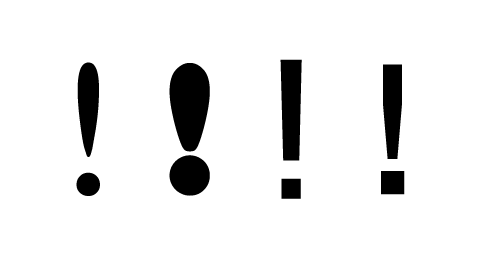
The next important decision was the exclamation mark. Experimenting with different shapes and sizes, Jamie & I agreed the far right example was the most appropriate for the concept.

As we started experimenting with the warning symbol, we realised there could be another symbol that would be better suited for the 'Extremely Hot' statement - the Hot Surface warning. I quickly mocked up a version of this and put it in place of the exclamation mark. I think it works better as it is a lot more relevant than the previous symbol.
Below are variations of the cover using the new symbol, also looking at different phrases to convey a better message:


After much debate, we came up with the 'Hot Talent' slogan. It's relevant to the group, the symbol and the concept we are trying to communicate. Instead of using an existing symbol, I proposed a slight twist that will still make it recognisable, yet more appropriate for the concept. I created a vectored pencil to make it closer to Graphic Design, an object that resembles the original straight line to convey a surface.
Variations of the new symbol below:


No comments:
Post a Comment