Showing posts with label Brief 6 - Context. Show all posts

Monday, 20 May 2013

How to be a Graphic Designer...

I've had this book for a while now, but I haven't properly read through it up until now. Some really interesting points, and I'm looking into reading further after the FMP has been handed in.

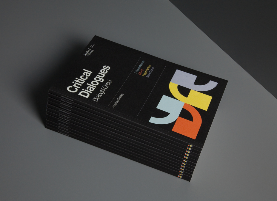
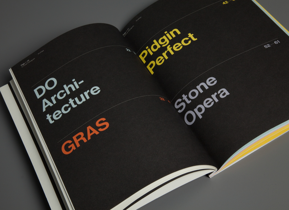
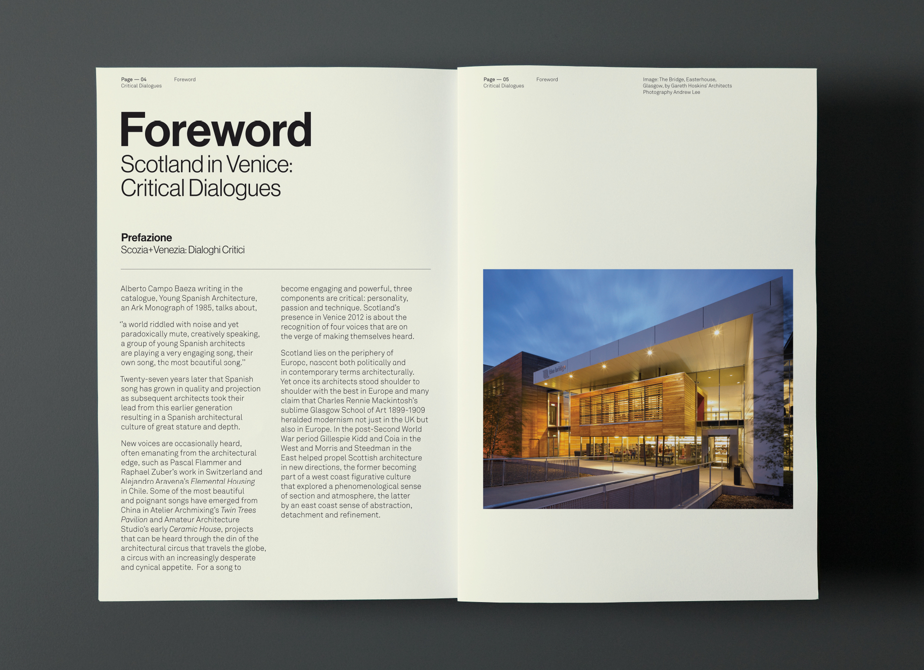
For a book that is heavily text-based, the design of the layout is beautiful. Each page is different, with varying column widths and text placement, whilst still looking structured. The choice of a spot colour to differentiate text and to create hierarchy is also a clever technique that could be employed for situations such as written interviews.

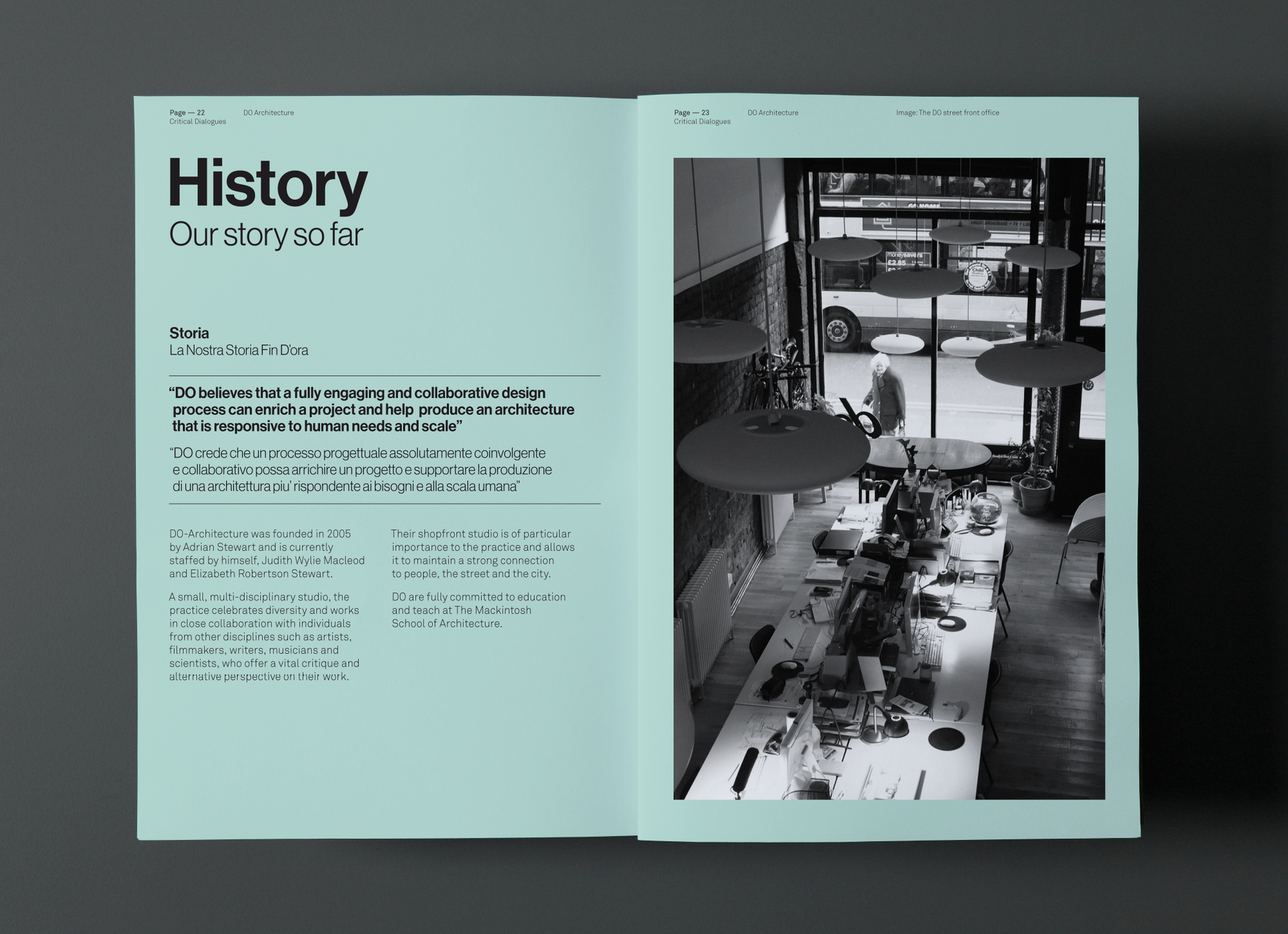
At first, I thought one of the pages was printed on blue paper. But then I realised there is a white in the image, so unless there was the inclusion of white ink then it would be impossible. Also, the other side is white, so it's more than likely printed with a slight blue backdrop. This is an alternative way to give pages colour, give it a tint of the spot colour that is being used to give an illusion of coloured stock.


Audi A1 Booklet

Not the most exciting bit of graphic design, but I love how clean and functional this booklet is. The use of a silver spot colour really gives it a touch of class and is completely relevant to the automotive industry.

I also love the format of the book, measuring 297x196 - a wide A4 format. It is a lot different to other books and challenges the conventions of regular publications.


Sunday, 19 May 2013

Critical Dialogues: Colour Categorisations


Categorisation is something that I will need to consider if I'm doing information graphics & in particular a Nordic music promotion which focuses on 5 different countries. Graphical House have used colour to separate different pages or categories, whilst keeping the same layout to make it visually consistent.


Ego Primevera 2012


A really nice example of clean layout and interesting bind. The bind itself promotes enough interest for me, as I haven't seen the ring bind used in such a fashion. It separates itself from other publications due to its unique approach.

The simple colour scheme works really well to give the whole publication a clean aesthetic, and monotone images complement the colours whilst still being clear.

Also, the inclusion of smaller pages on different stock to separate content is an technique that I could employ within my context book when dealing with features such as interviews, away from the image-based material.


Tuesday, 5 March 2013

Revealing Devices

On the front cover in particular, devices can be used to reveal a hidden message, or to reveal the full picture. This can be done in a number of ways, through slide-outs, additional print outs to be placed over front covers or belly bands to name a few.


This is a design for the book design awards. Using a printed device on the front cover, the message 'don't judge' extends to 'don't judge a book by its cover.' A clever play on words, and something that has context within the event that it's representing.

Monday, 25 February 2013

Heydays


Another example of communicating a message using the stock, this time through debossing and embossing. It keeps the publication as minimal as possible - giving it a clean, professional outcome. This technique is only really reserved for the front cover, as the effect could flatten and distort if pressed in between multiple pages.

Snitt: Consistent Publication Design


It is important to be consistent in design throughout a publication. This particular example, Snitt, uses the colour purple throughout to keep consistency, and also to keep things simple.  The reader realises the identity of the publication throughout and this gives it a certain aura - it shows the publication is a whole work of design and not multiple individual pages.

There is also evidence of a set going on - distinguished by different colours. This shows that the use of colour can be used to separate parts of the set, and the consistent design styles demonstrate the separate publications are part of a whole body of work.

Book Covers


This is another example of dye-cutting a front cover to add depth and to reveal part of the content underneath. It is a shame there's no content but the front covers definitely promote interest, and are consistent enough to work as a set.

Friday, 22 February 2013

Agenda - Simplicity in Layout


This set of publications show how simplicity in design can create beautiful and completely functional editorial design. There is no need to overcomplicate the layout, it just needs to frame the text well and tell a story in a structured way. It needs to be easy to read, which is achieved by breaking down walls of text into distinguishable paragraphs. The designer needs to ensure there is an acceptable number of words per line - an average of around 6-8 for single column layouts such as these should be fine.

The range of front covers could represent different publications with the same underlying theme, that would aim to work as a set, or could simply add a collectable factor to one publication - much like special editions of high-end magazines. Collectable issues could be something to consider in briefs 3 & 4, when exploring the range and potential of the briefs.

+++

Dye-cutting in Editorial Design


Dye-cutting the front cover of a publication can reveal hidden meanings underneath - a technique that can add depth to the publication. The first example adds lines of colour whilst making a 3D shape out of the book, something that could provoke interest and interaction from viewers. The second uses typography as a way to add depth, but this flyer could easily work without a backdrop. It is a way of communicating a message on stock, without using ink - much like embossing and debossing.

This process, however, would add to the budget of the print job significantly, which could be a factor when choosing to use this technique.

+++

Friday, 15 February 2013

Newwork Magazine


The layout of the type and images has been well considered, and the design composition differs on each page which freshens up the whole publication. This is an example of editorial design catered for mass production - printed on cheap stock that could potentially be handed out for promotional reasons.

One criticism I have with the work is the use of colour. The designers have chose to feature red on the front cover, but haven't replicated it anywhere else in the publication. The black & white print, whilst minimal and suited to the layout, looks a bit dull in comparison to other editorial pieces I have looked at previously.