
Showing posts with label Brief 3 - Endangered. Show all posts
Showing posts with label Brief 3 - Endangered. Show all posts
Wednesday, 29 May 2013
Friday, 24 May 2013
Booklet Development
The next stage was to develop the booklets further. Here is development of type layout, as well as placement of the elements of the poster. These booklets will be handed out as a direct form of communication:
Thursday, 23 May 2013
Final Poster Development
I applied the layouts to the other animals and introduced a colour scheme. This categorises the animals and will allow the animal to build up an identity this way.
I also added a little more colour to emphasise this identity. It makes the black highlight parts of the layout which gives it a stronger effect.
Developing Final Posters
Using the Javan Rhino as a base, I developed the infographics and the layout of them, on the poster.

Different kinds of pie charts. I prefer the block coloured ones, with a thick stroke, as they match the aesthetics of the icons.

The transformation of the size comparisons from the thin lines to the dotted labels. It is cleaner and goes with the colour scheme.


A campaign slogan helps to keep it recognisable, and a strong message will encourage people to act.

Wednesday, 22 May 2013
Polishing Off The Restore Logo


I can't help but feel it looks a little to 'surfy' at the moment. I can't really explain it, but the big logo with small text makes it look like a brand of clothing aimed at surfers. It's not really appropriate. Especially in Edmondsans (I did an extra test to be completely sure). The bottom example looks a little better, and it helps having Gotham.
I feel as though I need a new typeface, however. One that reflects the symbol. Something rounded, whilst still being uniform. I did a few tests to prove that serif & slab-serif weren't appropriate:
I feel as though I need a new typeface, however. One that reflects the symbol. Something rounded, whilst still being uniform. I did a few tests to prove that serif & slab-serif weren't appropriate:


Eventually, by flicking through Fontbook, I found a typeface that was perfect:
Museo Sans

Final Logo
Made the logo smaller to avoid being that clothing label I described. Looks oddly more formal, and more relevant to a campaign. Adjusted the tracking, and made final tweaks to the logo by offsetting the path slightly. This would make it a little more spacious at smaller sizes:

---

Creating A Symbol For 'Restore'
Restoring takes time. It's not something that can be done overnight. As I was thinking this, I thought of the dreaded Apple wheel, constantly spinning away. The spinning represents time, and in still motion the best way to replicate it would be through a spiral.
At first I used the spiral tool:


At first I used the spiral tool:
This looked pretty unspectacular. I've seen it before, so I tried something else that really got me thinking:
The twist tool can be made to create unpredictable objects, but with a certain degree of control. This was made from a full circle, which created an interesting spiral shape. I attempted some more below, having more control this time to shape it into something that I wanted.
I love the middle one. I just love how it still has a solid shape, and in a way it looks like a fetus, which is incredibly relevant. The only trouble is, it looks a little ropey at the moment. This is the process I took to restore the shape back into a circular, smooth, shape.
I did this by simplifying the shape:

Changing the Name of the Campaign
The more I look at it, the more I don't like the name In Danger. I think the name was a little rushed, and if doesn't have an action involved in the name, like all campaigns should, for example:
Save The Trees
Act For Wildlife
Don't Drink & Drive
The point of the campaign is to help restore the population of these animals, as they're in danger of going extinct.
By swapping the vulnerability to the action, in this case in danger to restore, there is a direct action or vision right there. It's so simple. So from now on, I will name the campaign RESTORE.
Logo Development:
I tried Gotham, a very neutral typeface, alongside my existing one:
It looks a lot closer to a campaign now, the letters look more consistent to WWF and they're more uniform than Edmondans. I tried the old name to prove that it was the better choice.
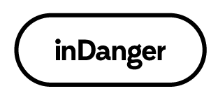
inDanger: Is The Logo Appropriate?
I combined the text logo, which was done in Edmondsans, with the WWF logo, probably the biggest endangered animal charity on the planet. My campaign is designed to send a message on behalf of the WWF, using the charity as a destination for the donations. This is what my logo looks like in comparison:


Ot doesn't look too much like a campaign at the moment, more like a product. I think at the moment the lowercase 'in' looks incredibly similar to the way Apple name their products, and that's probably why I feel this way. The iPhone, the iPod, the iMac; the list goes on. I tried the logotype in full caps, below.
Looks a little better, but I'm not sure I like the 'N'. The characters are totally different and now I'm back to square one.
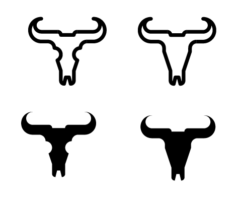
inDanger: Creating A Symbol
To develop the campaign's brand, a logo to accompany the logo text would make it stronger and more prone to being recognised. I think a strong symbol of endangerment is undoubtedly death, so a symbol for an animals skull would be extremely relevant and a powerful image, albeit a little morbid.


---
Overall, it was quite hard to replicate this in logo/silhouette form, and I don't think it brings the right message anyway. Also, I realised near the end that it sort of looks like a uterus, which was completely accidental. So, it's probably a good job it doesn't work.
InDanger: Creating a Campaign
To make the infographics as part of a set, it would be smart to wrap them together in one big campaign. I wanted something simple and to the point, preferably a play on words. I stuck to something that is relevant to the cause:
In Danger.
Type Logo Development


In Danger.
Type Logo Development
Although I liked the text, the symbols accompanying them weren't really cutting it.
Subscribe to:
Posts (Atom)