Showing posts with label Brief 4 - Context. Show all posts

Wednesday, 8 May 2013

Movie Poster Research

I think it would be good to do a little research in the kind of typefaces, and aesthetics, movie posters of the past have used. Granted, there are many many films and millions of posters, but I want my logo to represent the entire history of film in the best way possible. Therefore, it must be timeless. Here are a few examples of movie posters that I have found:


They're all varying in style, and genre, but the name of the film stands out in all of the examples. I therefore need to make an identity that is bold, and relevant to film. Pretty obvious stuff, but it helps to visualise aspects of movie culture through posters. After searching for a while and looking for a 'timeless' look, I found some Art Deco responses to modern movies. Here are a few examples:


These posters demonstrate the effectiveness of modernising classic themes or aesthetics. Because this is a modern response to an art form present in the 1920s and 1930s predominantly, it's hard to label it with a time period and it therefore looks timeless.

The typefaces used in these examples are mainly sans-serif, and I have noticed that a theme of art deco typefaces are capital letterforms with low crossbars. It is most apparent in the A. It would be perfect to use a modern Art Deco typeface as part of the identity, so I will review the typefaces that I have brought up as relevant to film so far and review the situation.

Tuesday, 5 March 2013

Revealing Devices

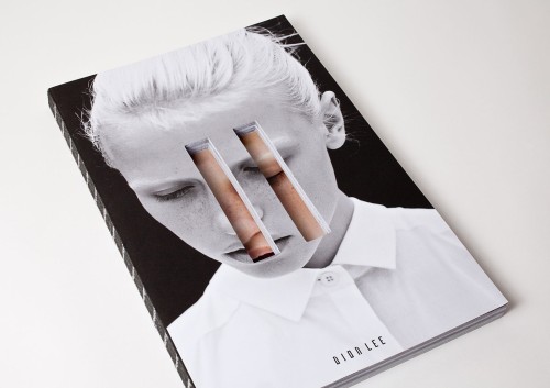
On the front cover in particular, devices can be used to reveal a hidden message, or to reveal the full picture. This can be done in a number of ways, through slide-outs, additional print outs to be placed over front covers or belly bands to name a few.


This is a design for the book design awards. Using a printed device on the front cover, the message 'don't judge' extends to 'don't judge a book by its cover.' A clever play on words, and something that has context within the event that it's representing.

Icon Packaging Tape


These are incredibly nice icons that are on a medium I have never really thought of - tape. This would be sold in gift stores alongside gift wrap to give the present an added touch of desirability. The tape is functional, and could be one part of a range focused on gift wrapping, stationery and other pattern-friendly mediums such as birthday cards, ties and pencil cases.


Tuesday, 26 February 2013

Pictograms Icons & Signs: Examples From The Book

I recently took out this book from the library that is very useful for brief 4 - demonstrating examples of iconography that is used in the real world. Airports use iconography to communicate to a range of people on an international scale - it is crucial that they are clear. 


Monday, 25 February 2013

Heydays


Another example of communicating a message using the stock, this time through debossing and embossing. It keeps the publication as minimal as possible - giving it a clean, professional outcome. This technique is only really reserved for the front cover, as the effect could flatten and distort if pressed in between multiple pages.

Book Covers


This is another example of dye-cutting a front cover to add depth and to reveal part of the content underneath. It is a shame there's no content but the front covers definitely promote interest, and are consistent enough to work as a set.

Friday, 22 February 2013

Agenda - Simplicity in Layout


This set of publications show how simplicity in design can create beautiful and completely functional editorial design. There is no need to overcomplicate the layout, it just needs to frame the text well and tell a story in a structured way. It needs to be easy to read, which is achieved by breaking down walls of text into distinguishable paragraphs. The designer needs to ensure there is an acceptable number of words per line - an average of around 6-8 for single column layouts such as these should be fine.

The range of front covers could represent different publications with the same underlying theme, that would aim to work as a set, or could simply add a collectable factor to one publication - much like special editions of high-end magazines. Collectable issues could be something to consider in briefs 3 & 4, when exploring the range and potential of the briefs.

+++

Dye-cutting in Editorial Design


Dye-cutting the front cover of a publication can reveal hidden meanings underneath - a technique that can add depth to the publication. The first example adds lines of colour whilst making a 3D shape out of the book, something that could provoke interest and interaction from viewers. The second uses typography as a way to add depth, but this flyer could easily work without a backdrop. It is a way of communicating a message on stock, without using ink - much like embossing and debossing.

This process, however, would add to the budget of the print job significantly, which could be a factor when choosing to use this technique.

+++

Valentine's Day 2013


This is another example of how simple a set of icons can be to communicate an idea. The way they're printed, two colour plus stock, and the fact that there is some debossing in the final outcomes shows the designer has carefully considered design for print, and should definitely be something that I think about when designing my movie icons publication.

+++

Tuesday, 19 February 2013

Simple Iconography


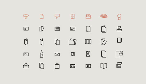
Examples of how a set of icons can be applied to communicate a message quickly and efficiently. It demonstrates the power of a good icon, and how simplicity is the key to make the icon instantly recognisable.

+++

Friday, 15 February 2013

Using Wood As A Stock For Design

Throughout my time on the course, my design has been focused primarily on print and the processes used to get a final outcome. Never have I considered wood as a material to host my final outcomes - it has been exclusively paper and card up until this point. I think it adds a hand-rendered quality to the designs as wood is a material rarely used in graphic design, even more so in mass produced print-runs.

Burning or etching a design onto wood is a technique that requires the constant attention of the designer, much like the process of screen printing. It shows the designer is prepared to make extra effort in the process of the final outcome, and therefore adds an element of desirability to the final piece.


These two examples show the type of designs that can be effectively transferred to wood. The designs have to be simple in a sense, photography would not be suitable for this process. Typographic and logo/icon designs are perfect for wooden outcomes, and it is something to consider as extensions to my Movie Scene Icons and They Said What briefs.

Vintage Logos


Although these examples are logos, they illustrate the importance of simplicity of flat vectored images if they are to communicate an idea. They could be replicated in any colour, and featured on top of any image - but it is the handful of examples that could be used as a 16 x 16 pixel favicon that are the most versatile. In iconography and logo design, the simpler the better.