
Showing posts with label Brief 8 - Nordic. Show all posts
Showing posts with label Brief 8 - Nordic. Show all posts
Wednesday, 29 May 2013
Thursday, 16 May 2013
Nutharc Music Scene Unlikely
Although I've created some really good promotional material for the typeface, I think the Nordic promotion is unlikely at this late stage, with the Endangered species being a major factor. That being said, I'm glad I took Fred's advice and fully developed the typeface as it is completely ready now for commercial use.
The Nordic Indie music scene will be developed after FMP for the End of Year Show.
The Nordic Indie music scene will be developed after FMP for the End of Year Show.
Wednesday, 15 May 2013


Tuesday, 14 May 2013
Tweaking the Specimen Book
Final decisions regarding layout and page order. I decided not to have the top and bottom lines as it was a little bit too unnecessary. I prefer the cleaner layout without anyway.
Font Guide: Tracking, Leading and More
Something that I think I need to communicate to my audience using my typeface is the way that they apply the font. This means tracking, leading and other characteristics such as when it is appropriate to use body copy and what size to set display text needs to be outlined in my specimen guide.


Here is my tracking demonstration set to 30/42pt like the other examples. I don't really like how the label copy to the left of the tracking (i.e. default tracking, +100 and +200 tracking) sit on two lines. This is the only way to get it to fit, however. This may need adjusting slightly.

It looks better on one line, but this forced me to sit it on top of the examples. It's fixed to the baseline grid, but looks a little too close so will need spacing out.

I thought I would add an underline effect to make it apparent that the text is titling something. It is the same colour and point size to the body copy so there could be some confusion.
I also added a little guide to what I have used in the actual specimen book. This is from the body copy, to the headers, to the font values of the demonstration texts. It tells the user what point size I have used, coupled with the leading values.

I went back to the introduction page to double check the consistency in terms of header font values. I decided to do a little more work on it:


I think the introduction page would look a little cluttered with the description, so I took it out and put in a short introduction page that clearly labels both typefaces. I moved the description over to the next page and coupled it with the specimen uses of the font:

Here is what I have so far, in PDF format. The pages are looking a little bit dull and disinteresting at the moment, so I am aiming to resolve these and bring the specimen book to a close by the end of this afternoon. All the development from this point forward will come in the form of issuu pdfs.
Designing the Content
The front cover is pretty simple and is a nice introduction to the theme and the aesthetics of the typeface. The opening page needs to give the reader a basic overview to back up the theme and purpose of the typeface.
It was also the time to set up character styles to ensure that the book is consistent throughout. I started with the simple Header and Body Copy, which is demonstrated in the example on the page.


I think the point size could be much bigger. As long as it is a multiple of 14 it will fit the grid. So I will bump the 19/28 point size up to 42pt to see how that looks:


It was also the time to set up character styles to ensure that the book is consistent throughout. I started with the simple Header and Body Copy, which is demonstrated in the example on the page.


I started to transfer over the copy from the posters I created, using the page to page format I described in the previous post:

30/42 pt.

Definitely an improvement. I'll bump it up to 56 to see if that looks any better.
42/56 pt.

Definitely more clear on the page, but I think it may be a little overkill. If I set the standard demonstration point size to 30/42 then I think it will work along a range of tests, such as the tracking one that I took out of my posters.
I also need to think about adding glyphs, numerals and accented characters to show off the range of my typeface. I started by adding the glyphs:

I don't think it really works. The characters are identical in both regular and alternative, so there's not much point putting them on both pages. I think accented characters would be more fitting in this situation.


I don't think it really works. The characters are identical in both regular and alternative, so there's not much point putting them on both pages. I think accented characters would be more fitting in this situation.

This works much better. There is a clear contrast and it goes with the letterforms well, demonstrating the range of foreign characters that Nutharc has. I just need to work out what to do with the glyphs...
I think it would be good to include some of the typographic works as part of the specimen books, as filler pages to keep things fresh and interesting. The glyph page suits this perfectly as I only need one page to demonstrate this:


Creating The New Specimen Book
After looking at Wim Crouwel's New Alphabet specimen book, I thought it would be a great idea to create a specimen book that demonstrates the full typeface and how to use it properly.
I want it to relate to the Ten Dollar Fonts promotional material that I have created up to now, but to also relate to my specimen posters in terms of stock choice and aesthetics. I am therefore planning on using the light blue stock to title the page, but have it cut half way to cover a plain, black & white nordic waterfall scene. Here are a few sketches below to demonstrate this:
[scan]
So I took to InDesign, using the same image as I have used in my .gif, and used this as the front and back cover:


Front Cover

Back Cover
Using the material from my specimen posters, this is a digital representation of what I will do with the light blue stock:


I will keep the same format as the posters - using a 14pt baseline grid and basing the point sizes on that. I can also use the tracking demonstration that I didn't use previously.
I think it would be good to demonstrate the typeface side by side on the page, regular:alternative. That way there is a direct visual comparison between the two versions of the typeface.
Monday, 13 May 2013
Specimen Poster Development
After the tutorial with Fred, it was obvious that I needed to expand my typeface into a set of deliverables before I even attempted to use it as part of my Nordic music promotion. Here's my development in PDF form:


To make this development successful, I needed to constantly print out experiments so I got a visual indicator of what the final thing would look like. Here is the process that I took, annotating and changing as I went:
I decided to scrap the tracking demonstration for now, and include it in a specimen book that I will produce after I have finalised the poster.
After experimenting with folds and ways to display the poster, I opted to stick to a 2:1 format, as I think it leads the eye down the page better. I need to expand this into the specimen book, keeping the aesthetics consistent to this and the digital promotion.
Final Poster
I used blue stock to relate to the colours used in my earlier screenprints, and can be replicated easily on screen.
Friday, 10 May 2013
Importing Final Character Tweaks & Other Adjustments
I noticed when using the typeface that the 0 was slightly small, so I enlarged it by 104% vertically.


 Looks a little better, and not too out of place like 104% was.
Below is visual proof of the application of my revised letterforms to my font:


This made it look a little too big, however, so I reduced the enlargement slightly to 102%.


Below is visual proof of the application of my revised letterforms to my font:

Tweaks to the Final Typeface: 10/4
This is the final tweaks to the details that will form my final typeface. After feedback from peers, tutors, Si Billam from Unit, Catalogue & Jay Cover, this is what I have come up with:


Final Alternatives


Tweaks to the D to make it consistent to the R.


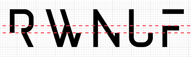
Deciding whether the cut-down versions of some characters should fall under the R, or the F. I think it looks better with the F as it is pretty much mid-way within the character's form, and the lower version doesn't look less consistent with other characters.
I liked my updated alternative X (middle), but the original (left) was more consistent with the whole typeface. I found a happy compromise (right) that keeps the visual style of the M and the Z, and is more simple than a regular X as it is possible to draw the letterform in one motion.
Subscribe to:
Posts (Atom)