
Showing posts with label Brief 7 - Prospectus Concept. Show all posts
Showing posts with label Brief 7 - Prospectus Concept. Show all posts
Wednesday, 29 May 2013

Friday, 1 March 2013
Prospectus Pitch - Final Boards For Submission


Project Evaluation
Overall, for a quick turn-around brief, I felt the pitch went fairly well. It was extremely hard to come up with an original idea from a recycled concept from last year. Although last year's prospectus was very strong, I think any other idea using We Are as a base will not match the hard-hitting statement that was We Are The State Of The Art. It was clear, rememberable and completely relevant to the institution.
That being said, We Are One attempts to take the snappy, rememberable statement to the next level. Although the relevance to an art college may not be there, it hints at a tight-knit company of specialist artists and designers. For people who want to study art or design at any level, Leeds College of Art is the place.
A criticism of me and Simon equally would be successful time management. Deadlines for a decided concept weren't hit, which means we didn't get the chance to print out, and bind, a mock up for a truer representation of the final publication should we get chosen. Consequently, the presentation for the boards isn't as strong as we'd hoped. We had more chance to nail down a concept, however, which is the main focus for the whole pitch.
Prospectus Layout Ideas
Whilst I was concentrating on the concept covers, Simon was getting on with potential layouts within the prospectus. As we were working, we would give each other running feedback which made the most of our collaborative practice. Here are the layouts that we were working on:
Towards the end of the layout experiments, we thought it would be a good idea to add the fresh green colour used throughout the college on doors, floor patterns and stair bannisters. It would keep to the college's current identity, it would give the prospectus a breath of fresh air and it would prevent the concept from becoming a stale, black and white set of visuals.
Prospectus Concept Ideas
These are our concepts in the form of potential covers. We experimented with various statements, centralised around the 'WE ARE' idea. Some of them worked well, but we felt the best way to represent the college would be through a new statement similar to last years. Therefore, we opted for We Are One which is a play on words. It represents the tight-knit community, suggesting that the whole college works as one, it suggests the college is one of a kind and it states that potential applicants should leave the college with the college as their number one choice.
We had other ideas, such as community represented by the infinite loop of the ring, and other statements that could potentially have a lasting impression, such as You Won't Get This* Anywhere Else.
We printed out a range of the concept covers that we thought were quite strong to get an impression of what they would look like on paper. We ended up scrapping the subtle domino representation of one present in the top corners as we felt the visuals could be too difficult to grasp the idea of a domino without an explanation. Keeping things simple.


Wednesday, 27 February 2013
Initial Concept Ideas
After the meeting with Rosemary we had a clear understanding of what needed to be submitted. 'We are', the concept from last year, is desirable within the marketing sector of the college. While we feel we can represent this again with our concept, we want to approach it in a different way and explore new ideas. To kick things off, we decided to brainstorm words we think the college represents:


Also, to make this possible, we have set ourselves a set of tight deadlines to ensure a smooth hand-in:
- 28/02 14:00 - Design material finished, printed on selected stock.
- 28/02 15:00-18:00 - Book binding.
- 01/03 Morning - Photograph mock-ups.
- 01/03 14:00 - Print slot.
- 01/03 16:00 - Concept deadline.
We want to explore book binding because we feel it will give the best representation of our concept. This is only possible if we meet these deadlines, so a quick design turn-around is vital. Concise decision making while maintaining a level of quality throughout is needed tomorrow, but I am confident we can pull it off.
Analysing The Prospectus Brief
Me and Simon Cherry have decided to collaborate for the concept pitch for the 2014/15 prospectus for LCA. The first point of action was to print out and analyse the brief itself - it was pretty in depth and covered a lot of areas but we also found some questionable material:
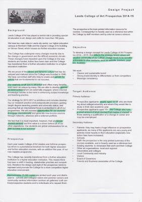


We added questions on the end of the brief ready to take to Chloe to clarify any misunderstandings. Chloe was in a meeting, but fortunately Rosemary answered our questions. Response:
- Would we be able to get copy & images for Surface Pattern and Printed Textiles?
Copy is available from last years prospectus on the LCA website and imagery can be mocked up at this point from another source. - How do we propose the costs? As a full job or per hour/week/day?
It's up to us, whatever feels fair. - Can we include the stripped down college logo or do we have to use the mosaic?
Probably best to use the mosaic at this point (Rosemary sent me the logo file). - The brief says 200x200 - past years have been 210x210, is this an error?
Unsure at the minute, is likely a typo, but any size presented is fine as long as it is roughly accurate and in square format. - How open is the budget?
Although there are limitations, the concept should aim to think big. Any ideas can be focused down later. - Do we include estimated printing expenses in our costs?
No, the college deals with this. - How have previous years reacted to the concept pitch, have they printed concepts out and photographed them?
Yes, aim to get concepts submitted as accurate and realistic as possible - it will give the judging panel a stronger indication of what your concept is about.
Subscribe to:
Posts (Atom)