Wednesday, 27 February 2013

Initial Concept Ideas

After the meeting with Rosemary we had a clear understanding of what needed to be submitted. 'We are', the concept from last year, is desirable within the marketing sector of the college. While we feel we can represent this again with our concept, we want to approach it in a different way and explore new ideas. To kick things off, we decided to brainstorm words we think the college represents:


Also, to make this possible, we have set ourselves a set of tight deadlines to ensure a smooth hand-in:
  • 28/02 14:00 - Design material finished, printed on selected stock.
  • 28/02 15:00-18:00 - Book binding.
  • 01/03 Morning - Photograph mock-ups.
  • 01/03 14:00 - Print slot.
  • 01/03 16:00 - Concept deadline.
We want to explore book binding because we feel it will give the best representation of our concept. This is only possible if we meet these deadlines, so a quick design turn-around is vital. Concise decision making while maintaining a level of quality throughout is needed tomorrow, but I am confident we can pull it off.

Bookbinding Session With Sarah

Because Amber kindly booked out the print & binding resources, I thought I would take advantage of this and do some pre-runs before binding any future final publications. Sarah was on hand to guide me through two binding techniques: perfect glue binding and japanese stab binding.

The first example, perfect binding, was done by clamping the collection of paper together in between 2 card boards and adding thin layers of PVA glue into the straight edge. The glue will then soak through the paper and bind the pages together. Multiple coats are necessary, either 2 or 3 after each one has dried, to firmly glue the pages together.

Japanese stab binding is carried out by drilling a sequence of holes (3 to 5) in a sequence roughly 10mm adjacent to the spine of the book. The holes are then threaded together with needle and thread in a way demonstrated by the youtube video below. I used much thinner thread when binding, however.


I glued the front covers on by PVA glue to cover the thread, and included a crease on the perfect bound example, with the pressing machine, to make opening the book easier and to reduce strain on the glued front cover.

Here are my binding examples constructed in the session today:


Analysing The Prospectus Brief

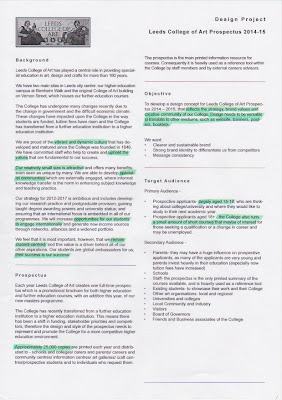
Me and Simon Cherry have decided to collaborate for the concept pitch for the 2014/15 prospectus for LCA. The first point of action was to print out and analyse the brief itself - it was pretty in depth and covered a lot of areas but we also found some questionable material:


We added questions on the end of the brief ready to take to Chloe to clarify any misunderstandings. Chloe was in a meeting, but fortunately Rosemary answered our questions. Response:
  1. Would we be able to get copy & images for Surface Pattern and Printed Textiles?
    Copy is available from last years prospectus on the LCA website and imagery can be mocked up at this point from another source.
  2. How do we propose the costs? As a full job or per hour/week/day?
    It's up to us, whatever feels fair.
  3. Can we include the stripped down college logo or do we have to use the mosaic?
    Probably best to use the mosaic at this point (Rosemary sent me the logo file).
  4. The brief says 200x200 - past years have been 210x210, is this an error?
    Unsure at the minute, is likely a typo, but any size presented is fine as long as it is roughly accurate and in square format.
  5. How open is the budget?
    Although there are limitations, the concept should aim to think big. Any ideas can be focused down later.
  6. Do we include estimated printing expenses in our costs?
    No, the college deals with this.
  7. How have previous years reacted to the concept pitch, have they printed concepts out and photographed them?
    Yes, aim to get concepts submitted as accurate and realistic as possible - it will give the judging panel a stronger indication of what your concept is about.

Tuesday, 26 February 2013

Pictograms Icons & Signs: Examples From The Book

I recently took out this book from the library that is very useful for brief 4 - demonstrating examples of iconography that is used in the real world. Airports use iconography to communicate to a range of people on an international scale - it is crucial that they are clear. 


Royal Court: Collecting Primary Material

I dug up some promotional material for theatres around Yorkshire that I had collected for Enterprise last year - I figured it would be useful for inspiration in Brief 1.

Although these are all promoting plays being shown in the theatre, I think the aesthetics of this material is relevant, in particular the choice of typefaces and the layout of imagery and type. All three are laid out well, it doesn't makes the reader feel overwhelmed. This is through line breaks in between paragraphs, and the choice of imagery used to break up the text.

A theme going through the first example is the choice of colour: represented by a spot colour that is consistent throughout. It gives the publication identity and demonstrates that each individual page is part of the whole piece.

The typefaces used in the body copy are similar throughout all three - simple, sans-serif. The point sizes  seem to fall between 8-9pt which is more than enough to make the publication legible. Typefaces used for the titles vary - slab serif, regular serif and also a bold serif that looks to be Clarendon.


[Georgian Theatre, North Yorkshire]


[Harrogate Theatre]


[Sheffield Theatre]

Monday, 25 February 2013

Fine Art Meeting 25/02

The meeting with the Fine Art team went well today, and has clarified the way forward. The students' statements, the photography of the work and the three portrait images will be given to us by next week - which will allow us to take the yearbook forward. Messages from the tutors on the course will also be given to us as pages designed to break up the yearbook.

For the meeting, as well as everybody's individual layouts and the initial team layouts, I constructed a sheet, including 18 various typefaces suitable for body copy, that could be compared and selected by the Fine Art team.


The team loved the layouts that we designed, and appreciated the effort we'd gone to in the short space of time. They agreed with the layout and didn't have any improvements that we should consider. Progress has definitely been made which is good, and if all the material is given to us by next week they easter deadline shouldn't be a problem.

Layouts for the meeting posted to the Fine Art studio door:


Heydays


Another example of communicating a message using the stock, this time through debossing and embossing. It keeps the publication as minimal as possible - giving it a clean, professional outcome. This technique is only really reserved for the front cover, as the effect could flatten and distort if pressed in between multiple pages.

Snitt: Consistent Publication Design


It is important to be consistent in design throughout a publication. This particular example, Snitt, uses the colour purple throughout to keep consistency, and also to keep things simple.  The reader realises the identity of the publication throughout and this gives it a certain aura - it shows the publication is a whole work of design and not multiple individual pages.

There is also evidence of a set going on - distinguished by different colours. This shows that the use of colour can be used to separate parts of the set, and the consistent design styles demonstrate the separate publications are part of a whole body of work.

Book Covers


This is another example of dye-cutting a front cover to add depth and to reveal part of the content underneath. It is a shame there's no content but the front covers definitely promote interest, and are consistent enough to work as a set.

Duolingo


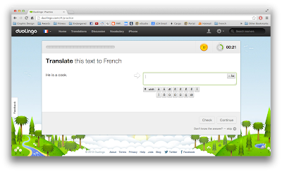
Duolingo is a free website that allows users to learn a second language. It is set out like a game, offering a levelling system and awarding coins for good performance. The interface is extremely user friendly and the owl mascot is something that children in particular could relate to.

When considering the department for health brief, it would be an idea to make a game out of fitness - to make it fun and informative.

26/02/2013 UPDATE: Duolingo emails the user if they realise they haven't been online for a while. It is designed as a friendly reminder, encouraging users to play on, without being forceful and unpleasant. It gives the user an achievable goal, and I have to admit that I was tempted to play on, if I didn't have other things on. If I had free time I would definitely click on the link provided.


Friday, 22 February 2013

Generating Content Ideas - Royal Court


This is a very difficult brief, in terms of content. There are limited resources online that outline exactly what goes on behind the stages of Royal Court's plays. I decided to narrow it down:


These videos highlight the events that go on behind the scenes - focused on the young and upcoming talent. This is the audience that I want to appeal to, as I think it has the most scope for generating interest and inspiration. After all, it is the future generation of playwrights that will produce material for many years to come.

By pointing the young who have interest in theatre to these events, they may be inspired to start writing themselves or to push themselves to achieve more. It will give the publication more purpose than just informing, and gives me a narrower audience other than general theatregoers. And after watching a handful of videos produced by Royal Court, it is apparent that a large chunk of their audience are young - something that surprised me.

As I mentioned before, I am considering creating a hot dog fold. Here are initial folding tests both A2 folded down to A5, and A3 folded down to A6. The A6 is more mobile and could fit in the average pocket, whilst the A5 variant would be able to hold more information. At this point, I believe I will make it short and sweet - communicating the vital information to the reader.