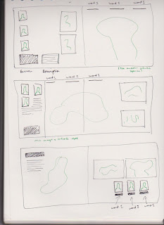
We all met after the monday briefing and discussed how we were going to move forward with the Yearbook. The Fine Art team came up with the theme ethos, logos & pathos, but we felt it was very vague and hard to pin down the concept. Instead, we decided on a rule of three which would be consistent throughout.
The meeting with the Fine Art team on Friday reassured us that the whole yearbook needed to be as visual as possible - three examples of people's work should guarantee this. Along with 3 images of the students' work, we're proposing 3 photographs of each person, and 3 key words to take out of the statement.
Last year's Fine Art yearbook was far too plain and predictable - each student had a double page spread with their name and description on the left page, and limited examples of their work on the right. The rule of three will ensure we have enough material to fill the yearbook, and to represent each student in the best way possible.
The content of the front cover will be decided in future meetings, the next one is scheduled on 25/02.
+++
As a quick response to the meeting, I quickly sketched out some initial layout ideas, in which I transferred onto InDesign and experimented with composition, colour and font choice.


No comments:
Post a Comment