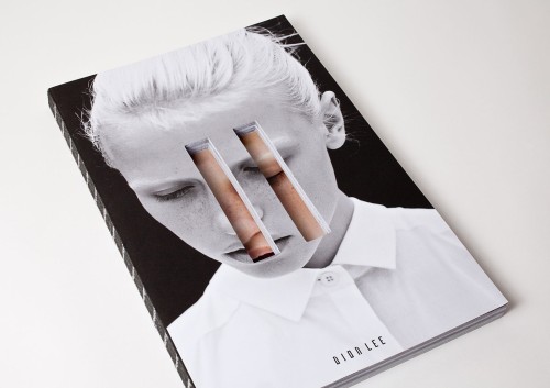
Dye-cutting the front cover of a publication can reveal hidden meanings underneath - a technique that can add depth to the publication. The first example adds lines of colour whilst making a 3D shape out of the book, something that could provoke interest and interaction from viewers. The second uses typography as a way to add depth, but this flyer could easily work without a backdrop. It is a way of communicating a message on stock, without using ink - much like embossing and debossing.
This process, however, would add to the budget of the print job significantly, which could be a factor when choosing to use this technique.
+++


No comments:
Post a Comment