I will lead you through this wonderland.
In my opinion, this line sums up my perception of the Nordic countries perfectly. Snowy, cold, but at the same time simply beautiful places that were made to explore. It only makes sense that this should be a starting point.
I laid out the letterforms from my Nutharc typeface initially, then tweaked the kerning and leading using squares of varying sizes as visual guides.
After kerning and tweaking the letters, I centralised the text and added a placeholder frame around the edge. Originally, I did this to account for any photographic imagery that would be in the background, but I like the aesthetic aspect of a visual frame. It separates the composition from the typical arrangement of typographic posters and adds an element of interest in the mix of functionality. I started to experiment with framing devices that mix with the aesthetics of my typeface.
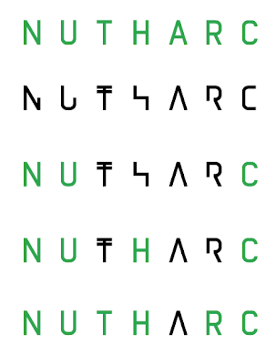
I started to make direct comparisons to my regular and alternative variation of the typeface, demonstrated by the green (regular) and black (alternative). Slight alterations are needed in terms of kerning, but both work relatively similarly. I was considering using my regular typeface for some posters, but I'd also like to stay consistent. The alternative version also adds an element of interest, as the letterforms don't conform to their usual form.
I decided to make another design: this time Bjork's brilliant It's Oh So Quiet that made it to number 4 in the charts in 1995. I chose this one, as the statement is only 13 characters long, which will therefore makes the composition different. More experiments with geometric forms that are hit and miss, although I like the zig-zag shape and the circular form. More will follow.


No comments:
Post a Comment