

Part of the branding for the Republique Theatre based in Copenhagen, Denmark. This typographic poster utilises the bronze circle to give the design recognition and to represent the brand. The overall composition utilises bold letterforms that could be read from a distance, packaged in a solid black frame and photographed professionally on a background that allows it to stand out.
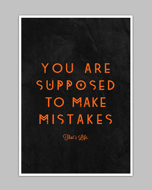
My initial thought when viewing this poster was the unorthodox letterforms are similar to my alternative typeface that I used in the screenprints last week. It adds interest to the piece, and distances itself from the usual, predictable typefaces commonly used in compositions like these.
Devices that mask the letterforms are interesting but aren't very functional if the designer wants to communicate a message. The format is interesting, however, stepping away from the traditional A# formats that are mainly adhered to with other typographic posters.

Another example of where the photography complements the design and creates a mood outside of the design itself. The collection of books and the vase of flowers on the bookshelf give it a homely feel that backs up the statement of the poster. It goes to show that the photography can add another element of interest outside the intended design. Here are more examples of this:


+++

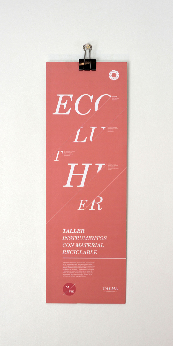
As a typographic poster, I have never seen anything like this. Using numbers to correspond to the order of the words, the viewer is forced to piece together the message themselves. Is this too much work for something that should hold a clear message? Maybe. There is definitely an element of interest, but the line between interest and functionality has definitely been crossed in this example. I like how it pushes the boundaries of typographic design and strives to create an interesting image, however, and the composition of the design suits the message.
No comments:
Post a Comment