Thursday 31 January 2013

Endangered Species: Initial Research

Since I am producing something that requires a lot of time into researching the project, I thought it would be useful to find initial lists of endangered species - giving me a starting point to focus down and eventually finalising a set of research that can be translated into data visualisation:

http://www.guardian.co.uk/environment/2012/sep/11/100-most-endangered-species-planet
http://www.dailymail.co.uk/sciencetech/article-2201459/8-000-scientists-plea-save-100-endangered-animals-plants.html
http://library.thinkquest.org/11353/e-animals.htm

Website aimed at children, but can still be useful for my project:
http://www.enchantedlearning.com/coloring/endangered.shtml
http://www.kidsplanet.org/factsheets/map.html

Aimed at an older, more sophisticated audience:
http://www.earthsendangered.com/

+++

A certain species that caught my attention was the The Red River giant softshell turtle (Rafetus swinhoei) as it is probably the most threatened species in the world - with only 4 individuals recorded alive today.


STATISTICS

Population size: 
4 individuals 
Range: 
Hoan Kiem Lake and Dong Mo Lake, Viet Nam, and Suzhou Zoo, China 
Primary threats: 
Hunting for consumption and habitat destruction and degradation as a result of wetland destruction and pollution 
Actions required: 
Education and awareness programmes, and captive breeding

Also known as the Yangtze giant softshell turtle.

(From wikipedia.org)
The Yangtze giant softshell turtle is noted for its deep head with pig-like snout and eyes dorsally placed. This critically endangered species holds the title of being the largest freshwater turtle in the world. It measures over 100 cm (39 in) in length and 70 cm (28 in) in width, and weighs about 70–100 kg (150–220 lb). The specimen caught from Vietnam weighed over 200 kg (440 lb). Its carapace, or shell, can grow larger than 50 cm (20 in) in length and width. Its head can measure over 20 cm (7.9 in) in length and 10 cm (3.9 in) in width. The male is generally smaller than the female and has a longer, larger tail.

+++

Wednesday 30 January 2013

Raconteur/The Times 2012


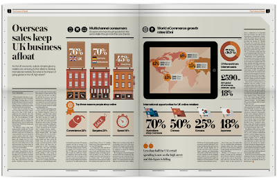
This is an incredible source for data visualisation inspiration. There is a wide range of graphic styles, from bar graphs, flow charts and pie charts - all to communicate data in a graphic form. It also demonstrates an intricate link between the graphics and the text - and how they can complement each other to tell a whole story.

It is important to be consistent with colour choice; having a simple colour palette stops the infographics from being too complex and overwhelming.

+++

Overprinting


Overprinting can create an interesting aesthetic value through screen printing designs. It can be replicated through digital print, but the unique outcome of the hand-rendered process gives a desirable quality when it comes to selling and exhibiting typographic design.

This particular example is nothing spectacular in terms of design composition, but it demonstrates the interesting relationship between the red and the cyan when overprinted. Interestingly, these colours are used to create stereoscopic images, where overprinting is a necessary process for the 3D effect to work.

+++


Although they're not screen printed, these digital images demonstrate an overprinted outcome, using it to take less emphasis off the red foreground - allowing the background image to stand out more.

+++

Tuesday 29 January 2013

Revised Briefs

After the discussion with Phil, I have decided to revise some of my briefs to make them more focused and understandable. I have chosen target audiences relevant to the briefs and listed the correct context in which my work will appear:

Thursday 24 January 2013

First Proposed Briefs & Phil's Feedback


Another possibility is a collaboration with a student from Fine Art or Fashion, in terms of branding & promotion, which is yet to be decided.
Phil's Feedback


The target audience needs to be specific in Brief 2 in particular, I need to get a focused audience and be more specific before moving forward.

Brief 5 & Brief 7 could be combined into one, but at the moment they are too similar.

Overall, I think I need to pad my briefs out and give them a bigger context in what to exist in. For example, for brief 5 I could add an event and the branding for that event for my typographic posters to exist in.

Before I deal with my statement of intent, I will sit down and brainstorm each brief to ensure that I have gone into the finest detail, and to make sure they're completely clear to someone who would pick it up with no background information.

Thursday 17 January 2013

Editorial


This editorial piece utilises a spot colour that makes an appearance as an overprinted device to add more colour to an otherwise dull black and white spread. It helps give the book an identity, but I sometimes feel a random splash of yellow is irrelevant and can sometimes overcomplicate the design; demonstrated in the third image.

+++


Conventionally, titles come at the top of the page. This example, however, uses an entire page to title the article. It goes against the norm, which provokes interest from the reader.

+++


I really like the combination between editorial design, and data visualisation. The simple colour scheme - mainly black & red plus stock, simplifies the book and helps to keep things fresh and easy on the eye.

+++


Typography


When using background imagery, it is important to consider the colour and shade of the typography in the foreground. With a particularly dark image, it would be wise to use a lighter (if not white) colour for the typography - and vice versa for a light image.

+++


Here are a few images collected from my Tumblr blog - dedicated in showing my daily typographic inspirations. Each example I consider a typographic poster, but each outcome is produced differently and have varying auras.

The first example works well as a set; each example complements the design of the next one. Photographed on a wall that contrasts the stock choice, it stands out and exhibits the designs in the best way possible.

The 'Neuarmy' piece uses photography composition to enhance the aesthetic and feel of the final outcome. Pairing the design with objects (in this case clothing) that relate to the design in some way give a whole new meaning - to me it seems a lot more homely than a standard poster-photographed-on-a-blank-wall outcome.

The third example, a quote from the excellent Ferris Bueller's Day Off, looks hand rendered as a chalkboard piece. This outcome is completely different to the standard typographic poster, and this alone enhances its value as a piece of typographic design. It emits originality, and sets it apart from the rest of the competition.

The last two images are brilliant examples of a working relation between type and image. The second design exhibits this much more clearly, experimenting with arrangement by setting samples of the typography behind the main image. It gives the design more dimensions, and has more depth than a standard two layer, type on image piece. More importantly, the images are clear & the type is legible.

+++

Infographic


A publication is a good way to display data visualisation. It prevents the graphics getting cramped up on one large page; it keeps things fresh by flicking through pages.

The infographics themselves are very minimal, using a two colour process to highlight key areas, which keeps the data clean and easy to follow.

+++


Similar to the example above, this infographic piece uses a publication to keep things fresh and prevents the reader from being too overwhelmed. The graphics themselves are a little complex and would take more time to develop an understanding of the content. Therefore, it would be suited to an older, more intellectual audience, and is not something that can be flicked through quickly. 

+++


This example utilises a mixture of circular charts and line graphs to form an interesting data visualised outcome. Different colours signify different subjects or themes, which is acceptable in this piece as the background is a solid colour and the composition is simple.

+++


Motion graphics can be utilised as a method of visualising data. Although animation is not part of my current practice, it's still important to consider as many different outlets for my design as possible with so many devices having access to design for screen.

+++


Wednesday 16 January 2013

Starting To Look At Context


In my FMP, I want to revisit screen printing, and here is an example of why. Colours are more ambitious and because the final product is produced by hand, it gains a unique, limited edition aura.  It may be more time consuming, but the end product is more desirable and will appeal to a wider audience  with an interest in print, compared to something printed digitally.

+++


The 'Young & United' brand is an example of how design can be integrated from paper to fabric - creating an identity that has scope to appeal to fans of both print and fashion. This is something that I would like to explore in my FMP.

+++


Typographic posters, if designed well, are beautiful to look at and also convey a certain message - whether it be inspirational, good advice or simply a memorable quote from a popular TV show. There are so many opportunities with typographic posters, in terms of print production, that I really want to explore in my FMP.

I enjoyed my Emotion & Type brief from the first module, and found the whole screen printing experience to be incredibly rewarding and more personal than the modern digital print out.

+++