I have done posters before with bands from the Nordic countries, and I thought it would be good to revisit this for potential material to go in the publication. Here is what I have so far, a mixture of what I was listening to at the time and bands in the list I made in the previous posts.
I am sticking to black and white at the moment, as I will be able to judge the typographic posters solely on their composition. Once I get designs that I am happy with, I will move onto colour experimentations and maybe the addition of photographic imagery, like the work that I did before I extended the Nutharc typeface:
NOTE: I have being using an older version of my typeface in this one, completely accidental. However, the 'V' has a visual quality that I love in the Love Love Love compositions. It's beautifully inconsistent. I'm stuck in a dilemma now - should I embrace the inconsistencies?

Tuesday, 30 April 2013
The Outpost Infographics


A range of infographics all based around the same visual style. Romauldo Faura, creator of the work, integrates his infographics within his illustrations as a direct link to the topic. It's a clever way to get the subject involved; the illustrations look playful and will encourage his audience to engage with what he is trying to communicate.
Also, the icons he has used are simple and effective. I really like the negative space they create in the black circles - especially on a coloured backdrop such as a vibrant red. It has got me thinking about appropriate stock to use for the infographics publication I will create for my Endangered publication.
Monday, 29 April 2013
Researching Nordic Bands
A very late stage to research, but it shouldn't take too long once I get a collection of bands together to feature.
Here are the sort of bands that I'm looking to feature, indie rock artists that may not have exposure. They have got to have a similar sort of sound otherwise they won't work as a set. Here is what I have so far:
Norway
Finland
Denmark
Iceland
Here are the sort of bands that I'm looking to feature, indie rock artists that may not have exposure. They have got to have a similar sort of sound otherwise they won't work as a set. Here is what I have so far:
Norway
- Team Me
- Casio Kids
- Howl
- Kings of Convenience
- Kakkmaddafadda
- John Olow Nilsen & Gjengen (Norwegian Lyrics)
- Jim Protector
- Heroes & Zeroes
- The Bear Quartet
- Friska Viljor
- The Deportees
- The Perishers
- Anna Von Hausswolff
- Bob Hund (Swedish Lyrics)
- Caesers (on hold)
- David & The Citizens
- Det Vackra Livet (Swedish Lyrics)
- Dungen (Swedish Lyrics)
- The Fallen Empires
- Mando Diao (too well-known maybe)
- Frederik
- I Break Horses
- The Mary Onettes
- Miike Snow (too well-known?)
- Peter, Bjorn & John
- Sad Puppets
- Sambassadeur
- Shout Out Louds
- The Sounds
- The Genuine Fakes
- We Do Not Negotiate With Terrorists
Finland
- Eleanoora Rosenholm
- Rubik
- Lapko
- Cats on Fire
- Damn Seagulls
- Murmansk
- Black Twig
Denmark
- Decorate. Decorate.
- Dúné (Bit americanised...)
- Efterklang
- The fashion (split up)
- The Good The Bad
- The Kissaway Trail
- Mew
- moi Caprice
- The Raveonettes
- Treefight For Sunlight
- Très.b
- VETO
- The Figurines
Iceland
- Of Monsters and Men
- Sígur Rós
- Soléy
- Banko
- Seabear
Friday, 26 April 2013
The Schmucks Record Sleeve


The type on the reverse side of the sleeve looks well structured, white text set of a dark background to allow for optimum readability.
I love how the pull-out publication has captions that are set on separate pages on the inside, to take nothing away from the images itself. It is a good way to get the best of both worlds: a full image and a full, articulate description.
Final Boards & Evaluation of the Project So Far
These are the boards constructed out of all the material we have developed, that was handed in to the marketing department. We added a little description on each board to help the team understand what we were trying to communicate, and guide them through our concept.
+++
Evaluation
I can honestly say this has been the most successful collaboration to date. Me and James run a very democratic system where every suggestion was tried out, using InDesign as a digital sketchbook to compare and contrast ideas. Nobody took charge, which is a common occurrence in these kind of collaborations, and I think this stemmed from trying absolutely everything, right from the initial brainstorm.
Baring in mind we started developing visuals for this work extremely late, due to other commitments, I think we've done pretty well. We had 22 hours, including 'sleep' to turn this around. That includes creating the boards and getting them to print. It was tight, but we managed to get it done.
In terms of the concept, I think it has a good of a chance of any of getting picked. The statement is short, snappy and straight to the point. It represents the mystery of the show, and 'bigs up' the event by creating hype around the students' work.
One thing that I thought we could have added was the foldable example of the poster to leaflet. As well as more signage, and more examples of what the college wanted. I think it would strengthen the proposal, and give us more chance of getting chosen to do the job.
Overall, the project was a success. Regardless of if we do or do not get picked to do the job, I think it has been a decent collaboration and I would like to work with James again, whether it be in the FMP or post-graduation.
Typefaces used: GT Pressura, Aperçu
Mocking Up Signage
This post demonstrates how I would mock up signage from the images that I collected previously. This was one of the college from across the road, which required two sides. I would cut away both sides separately, to see how one side worked alongside existing material.
I then mocked up the side by placing the image in and using skew to get the perspective right. It doesn't have to be perfect, but it helps to get a good idea of how it would look.


Developing the Private Invite
Before we even started doing anything visual with the private invite, we both knew it had to be well considered and printed in a way to make the receiver feel special. One idea we came up with, was to flip the back and the front of flyer material over - it is not something that the viewer would expect. Typically, there would an image or the identity of an event on the front, and information on the back of the invite.
So, taking the image away from the front of the invite would make it extremely plain and basic - there would be nothing to it. So, in an effort to show the viewer that there was something there, we would propose a blind emboss that wouldn't be as visible, but would still show clearly that something is there.
After the concept of the invite was made, it was just a case of developing the layout of the back, which again would demonstrate our typographic capability.
Developing The Flyer
The front of the flyer would be the identity used on the poster and developed earlier. The back of the flyer, however, needed to include a range of information through carefully considered type. This is something that we wanted to communicate to the marketing team - yes we can use photoshop to mock things up but do we have an awareness of type layout and hierarchy? A proposal full of mock ups would not show this.
This is the development that we did for the flyer:
Again, we thought the use of the logo would be vital, as the college's brand needs to appear as many times as possible, in the most visually blatant way. Although the main focus is the identity for the show, the college logo should come a close second in terms of hierarchy.
This is the development that we did for the flyer:
We started developing with a black backdrop, to keep the white text that we were producing before. After a few variations, we decided that it didn't look consistent enough to the poster and the image, so we started developing the flyer with black text on stock.
Again, we thought the use of the logo would be vital, as the college's brand needs to appear as many times as possible, in the most visually blatant way. Although the main focus is the identity for the show, the college logo should come a close second in terms of hierarchy.
Creating The A2/A0 Posters
After we finalised an identity, we thought the logical step was to apply it to our printed material first, before mocking it up on signage. We started with the A0/A2 posters, as they would be essentially the same:
Something that we thought was vital was the use of the college logo. Without that, it would be difficult for the viewer to immediately recognise who the promotional material was for. We moved the logo around until we were happy that the placement would get the most attention, then we moved the type over to the other side.
We continued using white as it was subtle enough to keep the focus on the main image, but visible enough for readability.
We continued using white as it was subtle enough to keep the focus on the main image, but visible enough for readability.
Developing An Identity
Now that we had the image, the next step was to create an identity. We decided to use the typeface GT Pressura, but we also recognised that we were open to change if it sees fit.
We had a few decisions to make, mainly on the colour and the placement of the type. We thought magenta fitted fairly well, but it took priority away from the main image and looked distracting on the page. We also experimented with tints, but the 75% tint of magenta that we used looked a little like baby pink, or a colour that would be used on childrens' toys for girls.
We found black to also be too distracting, and the grey blended into the background too much. In the end, we decided that white would be the best colour. The uploaded PDF shows how we made this decision and our experimentation with placement, point size and the use of an underline.
Photoshopping The Images
This will demonstrate the process took from original image to the image that will be used on the promotional material. Note, the original image was taken in Studio 4 with no lighting or tripod - it was not a professional job. We literally had 21 hours to turn this brief around.
I also used a student's work that I was working with on with the Fine Art - Abi Moffat. I had to ask her later if it was alright as the timing was inappropriate as it was the early hours in the morning when the decision was made. The others were from a brick wall found online and the leopard print found downstairs in the Mosaic Cafe.
I extended the final image to make it friendly for posters and placing type - it is also available for long banners that are suitable outside the Vernon building.

Original Image


Make a selection around the chest area

To test I put a green fill in with the 'multiply' option on. I would put the artwork in later.

Touching up the edges, getting rid of the black stripes
+++
Typeface Considerations
Obviously, it's good to test out different typefaces and how they hold the message - expect the unexpected. I thought it would be good to set them out on big sheets of A3, print them out and analyse them with James. Demonstrated below are 3 variations of the same typeface, one title case, one uppercase and one with 100 tracking to give the type balance on the white space:
We were looking for a bold typeface that embraced the white space, and one that would be adaptable along a range of deliverables.
We were looking for a bold typeface that embraced the white space, and one that would be adaptable along a range of deliverables.


Taking away the serif typefaces - they weren't relevant

After little debate, we decided to go for GT Pressura (bottom), after narrowing down the options to that, Trade Gothic and Gotham.
Taking Photographs Around The College
The first order of business was to get some primary images, so we took a digital SLR out and took some snaps around college. One of our ideas was to portray a student opening his shirt to reveal something that is unexpected - animal fur or something similar. Here are the images that we got to work from:
Tuesday, 23 April 2013
Collaboration On The End of Year Show Pitch
As it is the final chance to make my mark on the college before graduation, I have decided to propose a campaign for the End of Year Show. I will be doing this with James Flanagan. It was pretty much a snap decision that was made on Friday, but with the Yearbook and other commitments we haven't had chance to properly work on it until today. Leaving it a little late, but we're both confident we can get it done if we make up the time during the night.
We came up with a bunch of ideas, and we were pretty sure that we were going to play on the idea of age for a while. Although we did have a lot of ideas, the one that stuck out for us was the 'expect the unexpected'. It was an idea that came out of sheer dialogue; it's entirely possible that we wouldn't have come up with it individually.

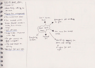

We chose the 'expect the unexpected' idea as we thought it was accessible to the college and had a powerful message. The other ideas, for example the 'no horsemeat', while comical and relevant to current affairs, wouldn't really suit an End of Year Show in terms of marketing it to a broad audience.
Currently, the brief would be a quick turnaround brief, which has potential to be expanded if we get the chance to develop the work. All work for this will be labelled as so:
Brief 9 - End of Year Show Pitch
We came up with a bunch of ideas, and we were pretty sure that we were going to play on the idea of age for a while. Although we did have a lot of ideas, the one that stuck out for us was the 'expect the unexpected'. It was an idea that came out of sheer dialogue; it's entirely possible that we wouldn't have come up with it individually.


Some initial ideas, playing on the idea of 'unexpected'.
We chose the 'expect the unexpected' idea as we thought it was accessible to the college and had a powerful message. The other ideas, for example the 'no horsemeat', while comical and relevant to current affairs, wouldn't really suit an End of Year Show in terms of marketing it to a broad audience.
Currently, the brief would be a quick turnaround brief, which has potential to be expanded if we get the chance to develop the work. All work for this will be labelled as so:
Brief 9 - End of Year Show Pitch
Monday, 22 April 2013
Dilate - Development for Extra Pages
This is some development for a collaborative practice within the course. It was my job to develop this page, which would eventually be involved to break up the students' pages. Also, with the style of breaking up imagery, I would hate to crop one of the members out and create a sense of unfairness.
It was tricky, as there was such a contrast of orientations in the photographs, but I came up with one that I am pretty happy with. It helped to simplify it, and the full image of the members help to clarify exactly who it is.

Saturday, 20 April 2013
Reverting Back To Some Original Letterforms
During my recent visit to Unit, Si told me that he preferred the previous letterforms I had for V, X and Z. He said they fitted the family better, and I had to agree with him. He said that because most of my alternative characters had elements taken away, that I should have kept this rule throughout. Even after I explained that the characters were designed to reflect the Futhark symbols, he explained that I should have aspects of the symbols that could be applied to all of the characters - in this case the minimalistic form.
The reason I altered them in the first place was because I thought they looked a little 'dull'. In hindsight, that isn't the point of a typeface, to change the characters based on their visual qualities - it's all about the visual consistency. Lesson learned.
I think he has a point, and looking at it now the characters do look a little out of place. I could always keep these for a second alternative, so my development isn't lost completely. It's a quick fix that shouldn't take long, so I thought I would do it now.

This is what I have now. the V, X and Z don't really go with the other letterforms, so I want to revert back to the style that I had with the alternative W. I copied over the regular letterforms as I think it will be easier to manipulate them.

I simply drew a box to the grid with matching height to the alternative W, and cut the element away from the letterform. I repeated the process with the U and here is what I have now.

The Z is constructed a little differently from last time, so I had to approach it in a new way. This is what I got when I tried using the same cutting technique, there is a little bit that protrudes from the top.
I divided the characters elements and brought the straight edge in to match the diagonal line of the Z. I then simply cut away the waste and was left with a finished character.

The X was made by dividing the shape and cutting away the top-left leg of the letterform, as demonstrated below:


Final letterforms revised to match the style of the original typeface:
Friday, 19 April 2013
Development For My Yearbook Spreads
Variations of my personal development for the yearbook.


Every students have their information stored as part of a textedit file. This can easily be copied in, and the words deciphered from the text, demonstrated above.


Some images are huge, 3000dpi is just too big. I altered them in Photoshop.


Other development, which consisted of me finding a balance of imagery, white space and text.


Subscribe to:
Posts (Atom)