
Showing posts with label Brief 2 - Health. Show all posts
Showing posts with label Brief 2 - Health. Show all posts
Wednesday, 29 May 2013
Wednesday, 20 March 2013

D&AD: Final Images & Boards
Here are my final images and boards ready to be submitted to D&AD. I have mocked up all the aspects that tell the full story, and have added short, but clear, labels to what it is I am communicating in the app.
Here are the words that I will be submitting that will accompany my images and tell the story of my project (400 Words):
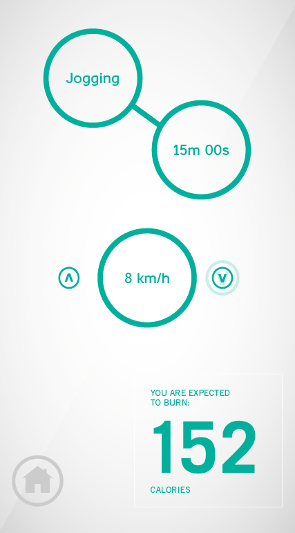
Activ is a smartphone app that embraces simplicity and functionality. Circles signify interaction - attached are examples of how two of the main features work. Users will set up simple goals, and will be encouraged to engage with the app daily through features such as the pedometer. It will effectively count calories burned through day-to-day activity, such as the daily commute to work/school.
Visual Mock Ups
Towards the end of the project, I decided to try visual mock ups of other aspects of ACTIV that could act as a range. Although the actions from psdcovers.com look very convincing, it really is a brilliant resource, I think on this occasion it doesn't add anything to the project, and the items could be perceived as an afterthought.


Tuesday, 19 March 2013
Finalising the App
Now that the printed material has been produced, photographed, and ready to be submitted, the final ACTIV app needs to be developed. Everything needs to be visually consistent, from the typefaces used, point sizes and the size and weight of the circles and lines. Here is the development of this, and the introduction of the new feature: Tip of the Day.
It may be apparent that I have changed some of the features. I wanted to simplify the app as much as possible and leave little guess work with the examiners of how these features will look. Features such as Treadmill TV could be questionable as nobody will be aware of what it is, how it works, and how it looks.
It may be apparent that I have changed some of the features. I wanted to simplify the app as much as possible and leave little guess work with the examiners of how these features will look. Features such as Treadmill TV could be questionable as nobody will be aware of what it is, how it works, and how it looks.
Photographs of the Final Prints
I got the final designs printed in the digital dungeon for optimum quality. They have come out well - I opted for James' white matte stock as it brings out the colours a little better, (barely) visible below:

Here are the photographs that I took of the finals, and the digital enhancement that I carried out on photoshop to make them look more visually striking and generally more professional.


Here are the photographs that I took of the finals, and the digital enhancement that I carried out on photoshop to make them look more visually striking and generally more professional.


Below are the digitally enhanced images and a screenshot that shows some of the process involved, including changing the vibrance and saturation around the centre point (my poster) to make it stand out. I also doctored some of the visual kinks in the stock to make the poster look smoother and more impressionable.


Monday, 18 March 2013
ACTIV Flyers - Physical Development
To get a true sense of what the final flyer will look like, I needed to print out what I have now and make changes to the physical copy. This can be changed in InDesign, and printed out again until I have a composition that is suited for print. A very trial and error process, taught by Graham in the type module last year and has been part of my practice ever since.


Friday, 15 March 2013
ACTIV - Transferring Current Designs to Print
Along with my app, I am going to have to produce some promotional material alongside this. I have got to a stage where I like the aesthetics of my app, and is something that I needed to transfer to printed media.
I started by making an A5 document, which would be the flyer for the promotional material. I chose to develop this first, as the same information as all the other material has to be used and condensed down into an A5 piece. Once this is completed, transferring this to an A3 or A2 poster should be pretty straightforward.
To keep with the design style of the app, I have used only Casper and Trade Gothic, and PANTONE 320 and black for now. This is the easiest way to stay consistent. Alongside this, I have experimented with circular devices used within my app.
The next stage is to print the examples off to make sure the point sizes and other material are suitable for print, and in proportion.
The next stage is to print the examples off to make sure the point sizes and other material are suitable for print, and in proportion.
Touch & Drag System
Another feature I have thought of, to add a quicker selection of intensity, is to introduce a touch and drag system, rather than forcing a choice through the interactive arrows. Much like in the world of automobiles, semi-automatic transmission only allows gear change one gear at a time, but manual gearstick control allows for gear change in one step.
This adds to the functionality and simplicity of the app, and enhances how user friendly it is.


This adds to the functionality and simplicity of the app, and enhances how user friendly it is.

First attempt was too dark, plus the background menu was too visible. I took off the dark overlay and instead lowered the tint of the black in the background to 5%. It gives the app a visual gesture that this feature is an extension of the feature in the background, but is not too visible that it becomes part of the foreground.


Thursday, 14 March 2013
ACTIV - Considering Home Page Navigation
Something I am yet to think about is how the user will get back to the main menu, where all the other categories are, when they're navigating the app. Firstly, I considered adding a little 'home' icon to simply revert to the main menu:


Simple, but effective. Again, this is something that I want to be clear in my app. Functionality is key.

However, having a little home icon on EVERY page might be a little overkill. While I was creating this icon, I thought of an even simpler way to get back to the home page: the swipe. Smartphones are touch screen, obviously, and the gesture of a swipe usually moves the current window out of the way and is a method for easy navigation. Why not take advantage of this? Here is a demonstration of how navigation will take place, and how I will communicate this:


ACTIV - Development of Other Pages
So, I hit a bit of a brick wall developing the main menu, so I thought I would start designing other pages to see if I could get the creative juices flowing.


I decided I would start on the Calorie Centre, as I had done a few initial designed previously in my layouts, especially to test the effectiveness of Casper as a body font when designing for screen. My main inspiration for this came from the Alarm Clock app researched previously. I really enjoyed the simple layout and design, and I wanted to replicate this in my app. Unfortunately, this meant that the main menu screen had become inconsistent.
I revisited the design of the main menu, but this time in the circular style of the Calorie Centre. I introduced the idea of varying sizes based on the frequency of use - but I found the idea to be too messy and cluttered, and some of the buttons may be too small to interact with.
I also altered the lighter background, giving it a gradient as well as a diagonal 3D effect that I had previously given the coloured backdrops. It still keeps the aesthetics simple, but it adds an extra dimension and stops the layouts looking too flat on a white background.
I also experimented with the typeface of the 'Calories burned' section. So far I had used Casper and Trade Gothic, but I thought I would explore other typefaces before settling with these:

Abraham Lincoln

In the end, I think Trade Gothic Regular is the better choice. It is a simple sans-serif typeface and keeps consistency with the logo. I have decided to use the uppercase form, as it separates itself from Casper's interactive lowercase form.
Here are the designs I have so far mocked up onto the appropriate format:


PSD Covers and More Logo Development
I decided, seeing as though I am creating an app, that I should be prepared to mock up. I was also intrigued to see how my progress would look if it were to be transferred to an app now. Using templates from psdcovers.com, an excellent website for this kind of thing, I mocked up a few initial screens. Here they are, in all their glory:

 I think the loading screen looks okay - it does exactly what it needs to do, which is present the app name clearly and be simple enough to not require much loading itself. I think this is alright for now, there shouldn't be much work needed.
The main menu, however, is pretty basic - it looks incredibly plain. I need to make it look more interesting, whilst still holding this information in a structured way that is clear and straightforward. Still, it's good to see the mockups are working.
I also decided to work on a few simplified logos. I will need one for the app logo and it's good to have an icon that can represent the identity:

I'm really liking the continuation of the arrow icons, in the form of up and down arrows. It is relevant to the app name & logo, it represents the changing intensity and customisation the user has on the app, and also keeps the use of the arrows constant and part of the identity.
ACTIV - Progress After Further Research
After researching more apps, I decided that I would try and outline the interactive features. One of the ways I did this was from the introduction of clear buttons. This simple device did wonders to solve the problem of the sparse layout I had earlier.
I also included prompts in terms of simple arrows to signify that interaction with the object will lead on to another page. This is incredibly similar to Summly but I have used the 'A' and 'V' in the ACTIV logo to create the arrows. I reduced the height of the letterforms slightly in the final arrow icons to make them more suitable.

Wednesday, 13 March 2013
ACTIV - Initial App Development
After I finalised my logo, I thought it would be a good opportunity to test out layouts and compositions for the app itself. I started with the loading screen and moved onto the main menu to get a feel for the aesthetics of the overall design.
I started by setting up the document for an iPhone 5 - 640 x 1136. Here is the progress so far:
I started by setting up the document for an iPhone 5 - 640 x 1136. Here is the progress so far:
It's just not working at the moment. It's early stages, but it looks somewhat... plain. I tried a number of backgrounds using Department of Health's colour scheme, and I like the simple 5% white overlay effect I tried with the blue as it gives it a bit more dimension than the flat green backdrop - it looks closer to a digital app.
The next step for me is to look further into successful iPhone Apps and what makes them so successful. I may need to do more initial diagrams and be more creative with it. I want it to be simple, but I don't want it to be dull and to evade interest from users. I will come back to this, but I need to approach it from another direction first. To be continued.
ACTIV - Logo Development
I decided to make a start. D&AD is due in a week and I've only got ideas so far - I need visuals. The whole app will represent the Department of Health, so with that in mind I will take the research that I did on their identity earlier and build on that for the application.
To start with, I did a few logo ideas with the name I had already chosen: ACTIV. I also downloaded the DoH eps logo so I have access to it throughout. I decided to use the colour scheme in the logo, the aqua green and the matte blue - or PANTONE 300 CVC and PANTONE 3268 CVC.
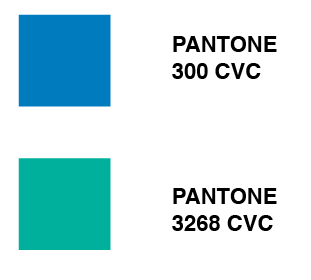


To start with, I did a few logo ideas with the name I had already chosen: ACTIV. I also downloaded the DoH eps logo so I have access to it throughout. I decided to use the colour scheme in the logo, the aqua green and the matte blue - or PANTONE 300 CVC and PANTONE 3268 CVC.
Here are a few quick logo ideas that I came up with. I am planning on settling on one for now and developing it further if I have the time after the content is complete. I think the logo type should be sans-serif and clear, modernised to represent the platform the app will appear on. Here are the initial ideas:

I used a range of typefaces that I thought would fit the bill including DIN, Quicksand, Trade Gothic and Casper. The latter is primarily a typeface for print, demonstrated by the slight indents on the letterforms (top example). I liked the idea of the bar knocked off the A to mimic the V. It represents up and down, relating to machines in the gym such as treadmills and cross trainers. I thought I would finalise this idea now so I have something to work with, otherwise I would be dwelling on it for too long. Here is my final (for now) logo:

Subscribe to:
Posts (Atom)