Showing posts with label Brief 1 - Context. Show all posts

Tuesday, 5 March 2013

Revealing Devices

On the front cover in particular, devices can be used to reveal a hidden message, or to reveal the full picture. This can be done in a number of ways, through slide-outs, additional print outs to be placed over front covers or belly bands to name a few.


This is a design for the book design awards. Using a printed device on the front cover, the message 'don't judge' extends to 'don't judge a book by its cover.' A clever play on words, and something that has context within the event that it's representing.

Theater Tanz Schule


This is branding for the dancing theatre 'Tanz Schule'. The photographs are consistently monotone, shaded with a dark blue colour that is used from the brand's colour palette. The bright orange colour is used throughout, and lends itself to the idea of screenprinting - using colours that are simply not possible when using the traditional 4 colour process (CMYK).

Tuesday, 26 February 2013

Royal Court: Collecting Primary Material

I dug up some promotional material for theatres around Yorkshire that I had collected for Enterprise last year - I figured it would be useful for inspiration in Brief 1.

Although these are all promoting plays being shown in the theatre, I think the aesthetics of this material is relevant, in particular the choice of typefaces and the layout of imagery and type. All three are laid out well, it doesn't makes the reader feel overwhelmed. This is through line breaks in between paragraphs, and the choice of imagery used to break up the text.

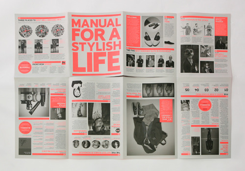
A theme going through the first example is the choice of colour: represented by a spot colour that is consistent throughout. It gives the publication identity and demonstrates that each individual page is part of the whole piece.

The typefaces used in the body copy are similar throughout all three - simple, sans-serif. The point sizes  seem to fall between 8-9pt which is more than enough to make the publication legible. Typefaces used for the titles vary - slab serif, regular serif and also a bold serif that looks to be Clarendon.


[Georgian Theatre, North Yorkshire]


[Harrogate Theatre]


[Sheffield Theatre]

Monday, 25 February 2013

Heydays


Another example of communicating a message using the stock, this time through debossing and embossing. It keeps the publication as minimal as possible - giving it a clean, professional outcome. This technique is only really reserved for the front cover, as the effect could flatten and distort if pressed in between multiple pages.

Snitt: Consistent Publication Design


It is important to be consistent in design throughout a publication. This particular example, Snitt, uses the colour purple throughout to keep consistency, and also to keep things simple.  The reader realises the identity of the publication throughout and this gives it a certain aura - it shows the publication is a whole work of design and not multiple individual pages.

There is also evidence of a set going on - distinguished by different colours. This shows that the use of colour can be used to separate parts of the set, and the consistent design styles demonstrate the separate publications are part of a whole body of work.

Book Covers


This is another example of dye-cutting a front cover to add depth and to reveal part of the content underneath. It is a shame there's no content but the front covers definitely promote interest, and are consistent enough to work as a set.

Friday, 22 February 2013

Agenda - Simplicity in Layout


This set of publications show how simplicity in design can create beautiful and completely functional editorial design. There is no need to overcomplicate the layout, it just needs to frame the text well and tell a story in a structured way. It needs to be easy to read, which is achieved by breaking down walls of text into distinguishable paragraphs. The designer needs to ensure there is an acceptable number of words per line - an average of around 6-8 for single column layouts such as these should be fine.

The range of front covers could represent different publications with the same underlying theme, that would aim to work as a set, or could simply add a collectable factor to one publication - much like special editions of high-end magazines. Collectable issues could be something to consider in briefs 3 & 4, when exploring the range and potential of the briefs.

+++

Dye-cutting in Editorial Design


Dye-cutting the front cover of a publication can reveal hidden meanings underneath - a technique that can add depth to the publication. The first example adds lines of colour whilst making a 3D shape out of the book, something that could provoke interest and interaction from viewers. The second uses typography as a way to add depth, but this flyer could easily work without a backdrop. It is a way of communicating a message on stock, without using ink - much like embossing and debossing.

This process, however, would add to the budget of the print job significantly, which could be a factor when choosing to use this technique.

+++

Tuesday, 19 February 2013

Hot Dog Fold

One consideration for the Royal Court YCN deliverable is to create a hot dog fold, which could be unfolded into a large image on the back - suitable for a pin up. The brief asks the designer to consider budget, and this would be a cheap and effective way of creating a short publication without the need for binding. Scale would be A3 for an A6, pocket-sized publication, and A2 for an A5 final.


This is an example of an effective hot dog fold, and judging by the point size in the photograph, on an A2 scale. The vibrant pink keeps the design consistent, and the amount of copy and information on the design demonstrates the hot dog fold's ability to contain vast amounts of information in a tight and compact space.

+++

Friday, 15 February 2013

Newwork Magazine


The layout of the type and images has been well considered, and the design composition differs on each page which freshens up the whole publication. This is an example of editorial design catered for mass production - printed on cheap stock that could potentially be handed out for promotional reasons.

One criticism I have with the work is the use of colour. The designers have chose to feature red on the front cover, but haven't replicated it anywhere else in the publication. The black & white print, whilst minimal and suited to the layout, looks a bit dull in comparison to other editorial pieces I have looked at previously.