
Showing posts with label OUGD303dc. Show all posts
Showing posts with label OUGD303dc. Show all posts
Wednesday, 29 May 2013
Monday, 20 May 2013
How to be a Graphic Designer...
I've had this book for a while now, but I haven't properly read through it up until now. Some really interesting points, and I'm looking into reading further after the FMP has been handed in.
For a book that is heavily text-based, the design of the layout is beautiful. Each page is different, with varying column widths and text placement, whilst still looking structured. The choice of a spot colour to differentiate text and to create hierarchy is also a clever technique that could be employed for situations such as written interviews.
At first, I thought one of the pages was printed on blue paper. But then I realised there is a white in the image, so unless there was the inclusion of white ink then it would be impossible. Also, the other side is white, so it's more than likely printed with a slight blue backdrop. This is an alternative way to give pages colour, give it a tint of the spot colour that is being used to give an illusion of coloured stock.
Audi A1 Booklet
Not the most exciting bit of graphic design, but I love how clean and functional this booklet is. The use of a silver spot colour really gives it a touch of class and is completely relevant to the automotive industry.
I also love the format of the book, measuring 297x196 - a wide A4 format. It is a lot different to other books and challenges the conventions of regular publications.


I also love the format of the book, measuring 297x196 - a wide A4 format. It is a lot different to other books and challenges the conventions of regular publications.
Sunday, 19 May 2013
Estudio Tricota: Some Nice Typographic Compositions
I was browsing through my design context posts to gather content for my publication when I stumbled upon a website that included a piece of work in a previous post:


As I was searching for this image I found some very interesting typographic posters that reflect my practice really well. I don't know how I missed them the first time, but why not feature them now?

They're really well considered and all utilise a simple colour scheme. I like the inclusion of icons as it sticks to the style of communicating information in its most simple form: text & icons. There are also some nice overprinting effects that give the poster depth and a sign that it was screenprinted. Which also adds a personal touch to the design.
Excavation: Expanding a Typeface


A very similar typeface to Nutharc, with similar inspirations. Morey was inspired by ancient alphabets, much like my inspiration of the Futhark runes. This is an example of how he expanded his typeface to create an identity for an archeology museum. It has context, and is completely relevant with the subject.
It assures me that the proposed expansion to promote the Nordic music scene makes sense, and is something that backs up the roots of the typeface.
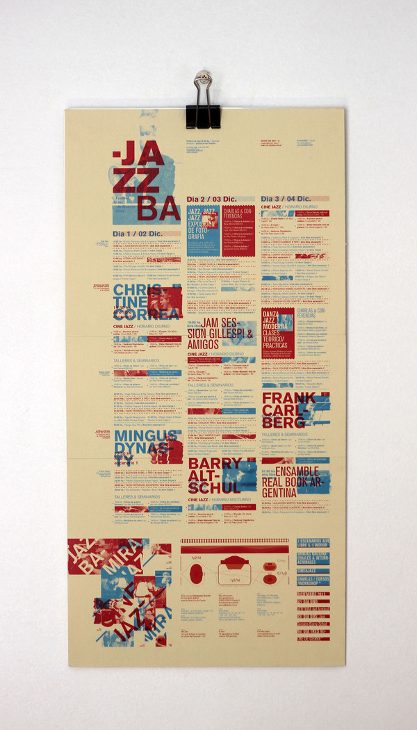
Varying Column Widths

I stumbled across this post on tumblr and I loved the various column widths. It allowed for captions, introductory paragraphs and the main body text to be flawlessly displayed in a visual hierarchy that works in an harmonious way.
The way the white space embraces the small text that is the captions lets the reader know that they accompany the image. The text boxes that spread over 2 columns must be more important and should be read first. This comes before devices such as a heavier weight of text, or taking advantage of the viewer reading top to bottom, left to right.
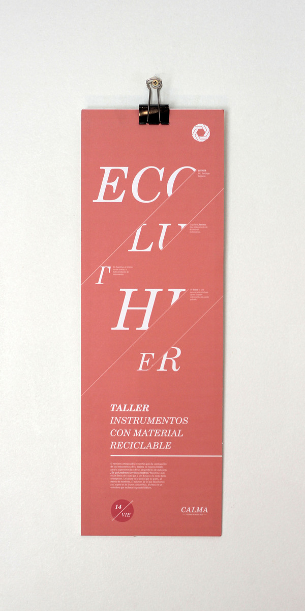
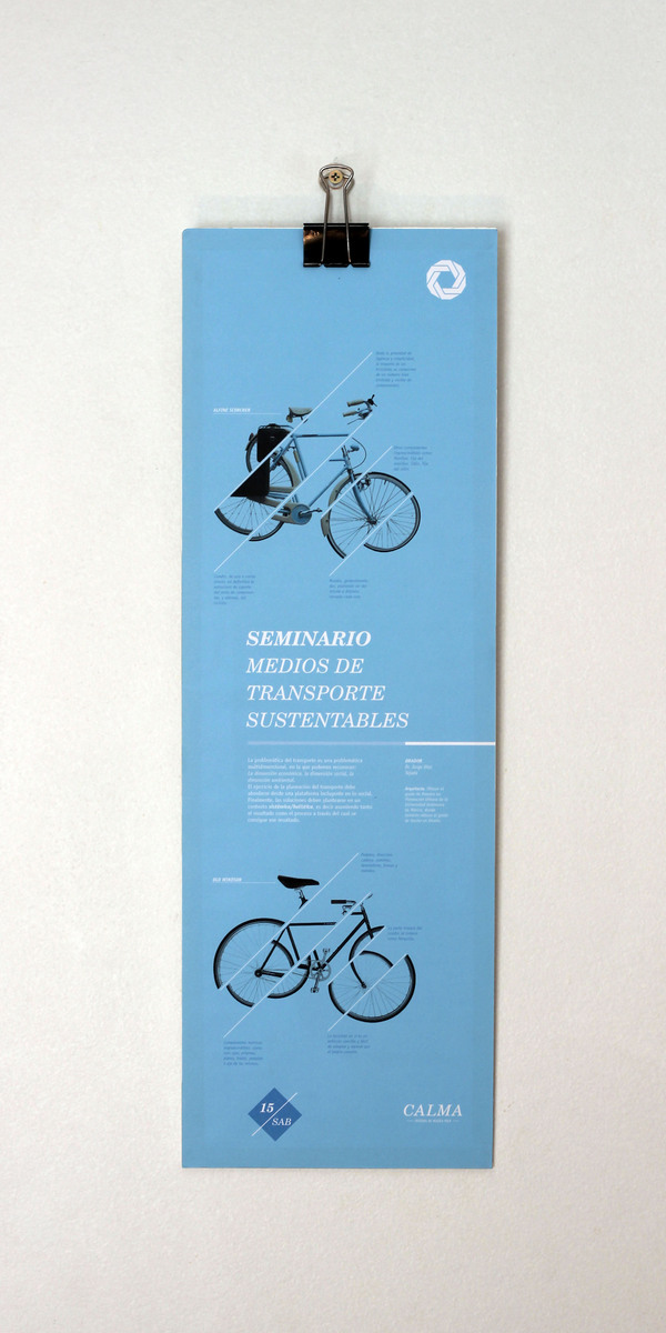
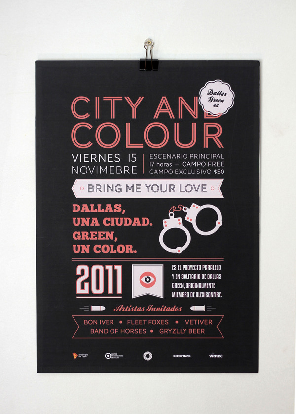
Proxy: Reducing Size of Posters and Vibrant Ink


Something that I love about this piece is the use of vibrant inks and the format. This poster would be done on a budget, from the photographs the stock is fairly thin and looks no thicker than 80gsm. This makes for easy folding, and it holds the colours well.
The poster has similar aesthetics to blueprints. Thin, striking lines often complex in composition to demonstrate a plan in the field of architecture. The fold down format also benefits the print as it is more portable and can be handed out easily if the purpose sees fit.
The Outpost Magazine


A clean layout for the outpost magazine. I really enjoy the vibrant colours, and the combination between a deep red background and the stock on the double page spreads above. This could be achieved simply by printing, but it could also be separate stocks combined in one publication. The sheer contrast engages the viewer, and the different stock could be used to hold designs that are separate to the layout, like infographics or typographic specimens.
Critical Dialogues: Colour Categorisations
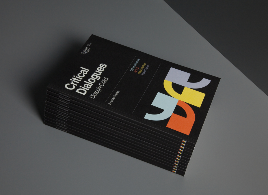
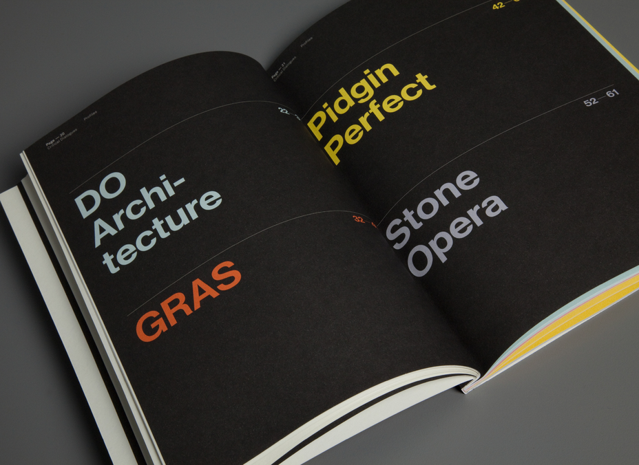
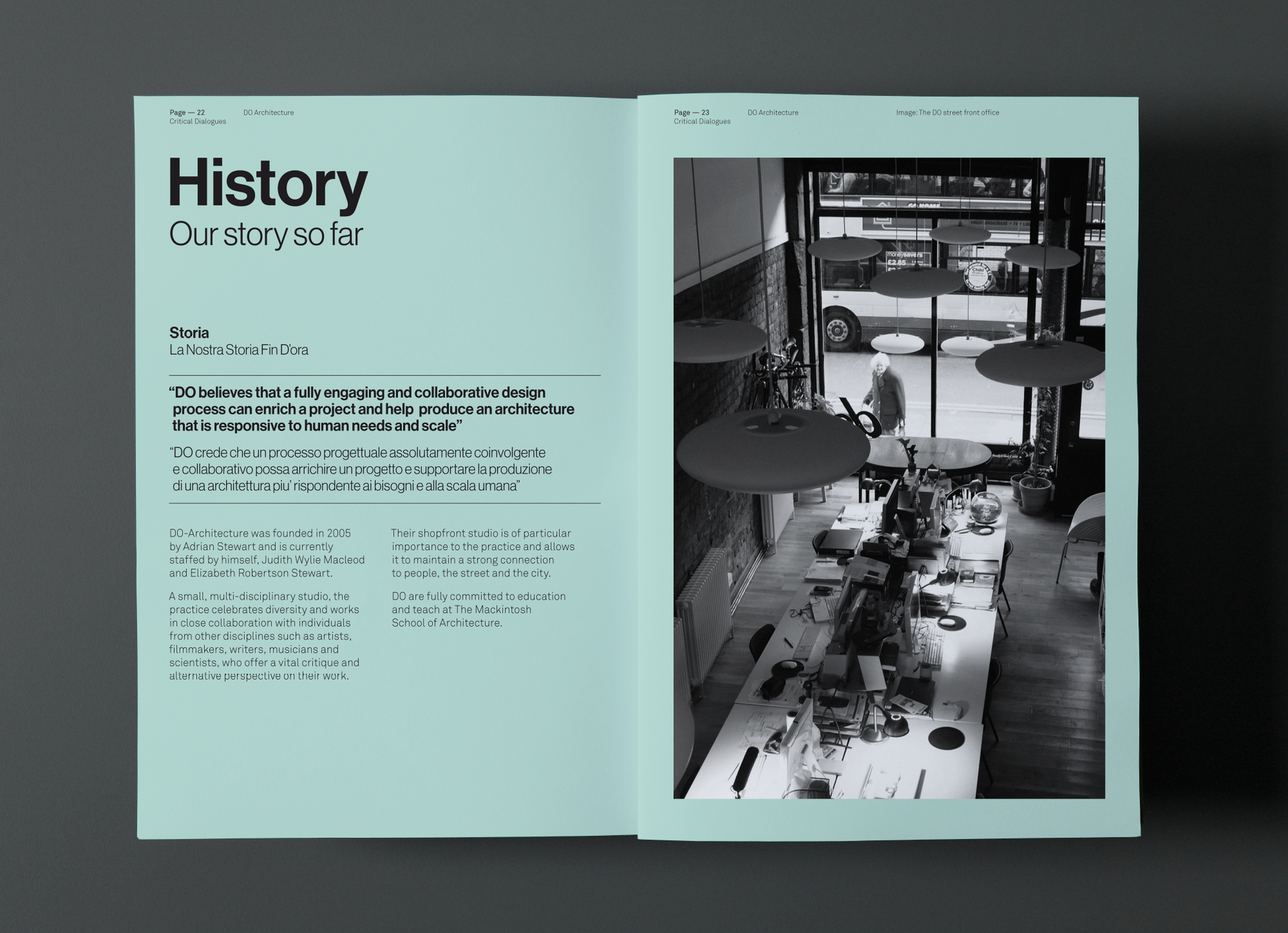
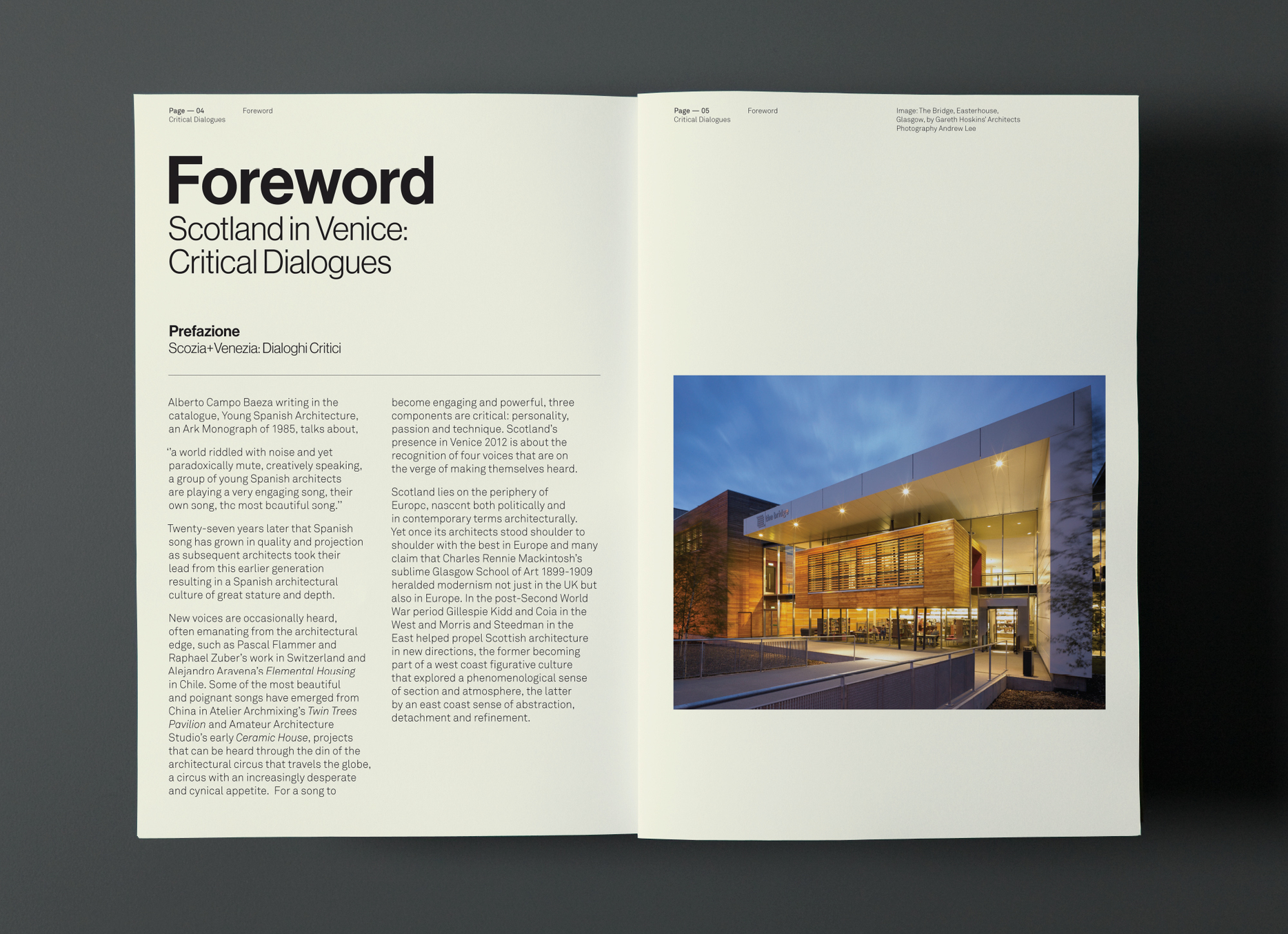
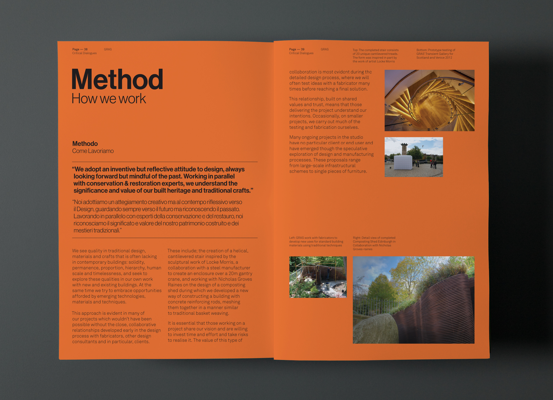
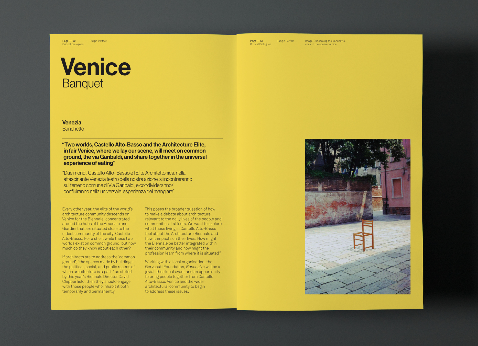
Categorisation is something that I will need to consider if I'm doing information graphics & in particular a Nordic music promotion which focuses on 5 different countries. Graphical House have used colour to separate different pages or categories, whilst keeping the same layout to make it visually consistent.
Ego Primevera 2012


A really nice example of clean layout and interesting bind. The bind itself promotes enough interest for me, as I haven't seen the ring bind used in such a fashion. It separates itself from other publications due to its unique approach.
The simple colour scheme works really well to give the whole publication a clean aesthetic, and monotone images complement the colours whilst still being clear.
Also, the inclusion of smaller pages on different stock to separate content is an technique that I could employ within my context book when dealing with features such as interviews, away from the image-based material.
Responses From My Design Context Interviews
It's taken a while for me to blog this, but it's important for my progress in my design context publication so I need to put it on here.
After my studio visit on the 3rd I proposed a few questions for the guys at Catalogue and Jay Cover. Here are the responses that I have got:


Thursday, 16 May 2013
Final Crit 16/5
After showing my work and comparing with other students at this stage, it's obvious I've got quite a lot to do. This will take a great deal of time and project management and will be a very hectic 13 days.
Here is my Feedback from Kirsty & Mitch:


Here is my Feedback from Kirsty & Mitch:


Saturday, 11 May 2013
Approaching a Type Specimen: Tim Ruxton Pseudonym
I think the best way to promote a typeface through printed means is posters, something that is entirely visual and shows off the typeface in the best way possible.
Tim Ruxton has created a beautiful promotional piece for his typeface - which is similar to mine in its exclusively uppercase letterforms. He has used only his typeface, and kept things simple as his typeface is not really suitable for body copy. Here it is:


Tim Ruxton has created a beautiful promotional piece for his typeface - which is similar to mine in its exclusively uppercase letterforms. He has used only his typeface, and kept things simple as his typeface is not really suitable for body copy. Here it is:
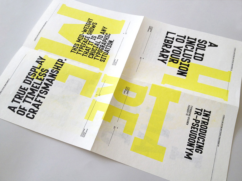
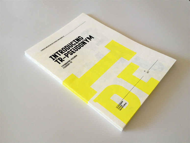
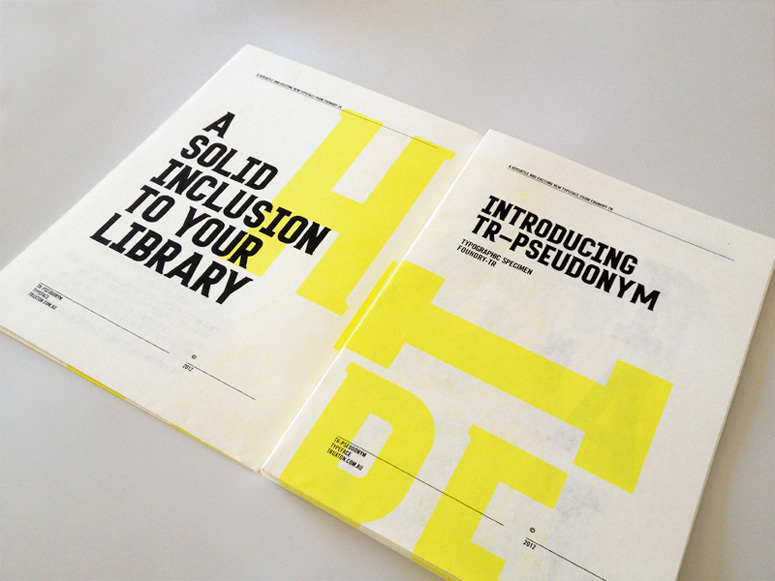
I really like the subtlety of the yellow; it allows the black text to stand out while still demonstrating the letterforms on a larger scale. I think two-colour plus stock would be the better choice as it keeps things simple and can help to secure an identity of the typeface, which will help in the promotional side of the font.
The fold-out format could be an option if I wanted people to take it away, it keeps it compact and avoids the use of poster tubes.
Subscribe to:
Posts (Atom)