
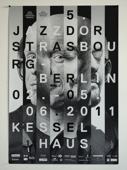
When using background imagery, it is important to consider the colour and shade of the typography in the foreground. With a particularly dark image, it would be wise to use a lighter (if not white) colour for the typography - and vice versa for a light image.
+++

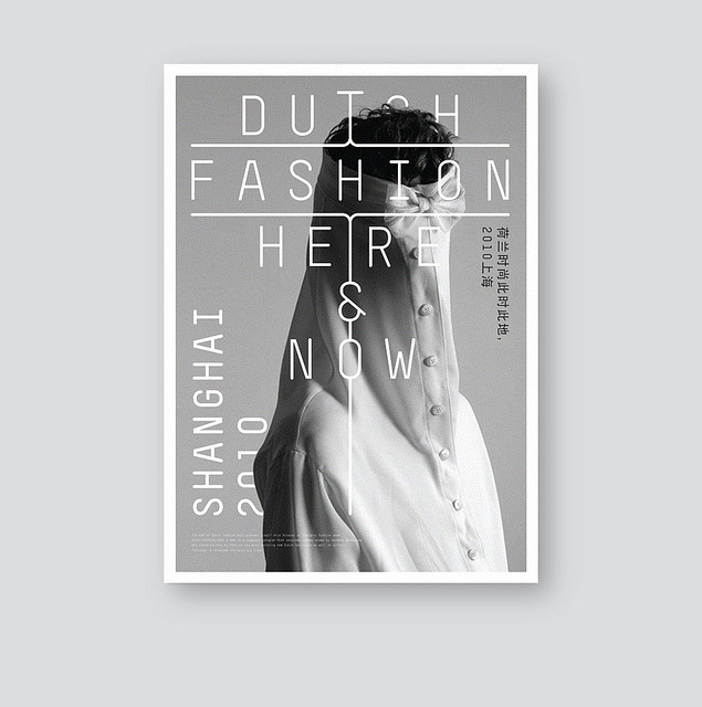
Here are a few images collected from my Tumblr blog - dedicated in showing my daily typographic inspirations. Each example I consider a typographic poster, but each outcome is produced differently and have varying auras.
The first example works well as a set; each example complements the design of the next one. Photographed on a wall that contrasts the stock choice, it stands out and exhibits the designs in the best way possible.
The first example works well as a set; each example complements the design of the next one. Photographed on a wall that contrasts the stock choice, it stands out and exhibits the designs in the best way possible.
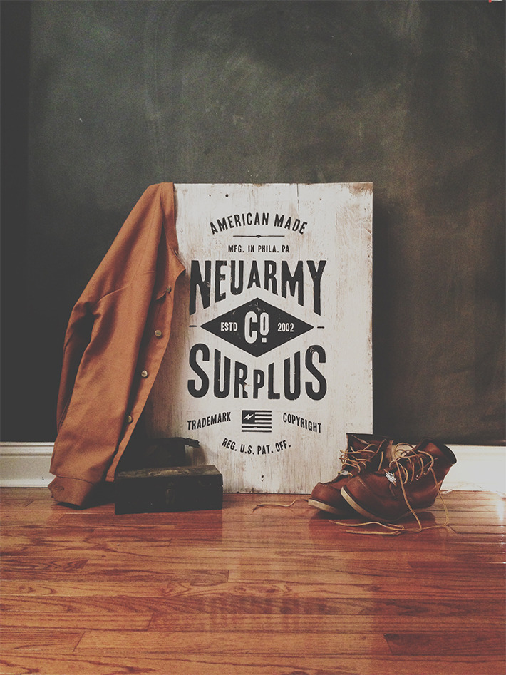
The 'Neuarmy' piece uses photography composition to enhance the aesthetic and feel of the final outcome. Pairing the design with objects (in this case clothing) that relate to the design in some way give a whole new meaning - to me it seems a lot more homely than a standard poster-photographed-on-a-blank-wall outcome.
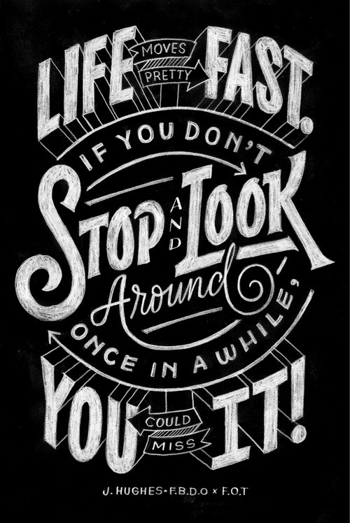
The third example, a quote from the excellent Ferris Bueller's Day Off, looks hand rendered as a chalkboard piece. This outcome is completely different to the standard typographic poster, and this alone enhances its value as a piece of typographic design. It emits originality, and sets it apart from the rest of the competition.
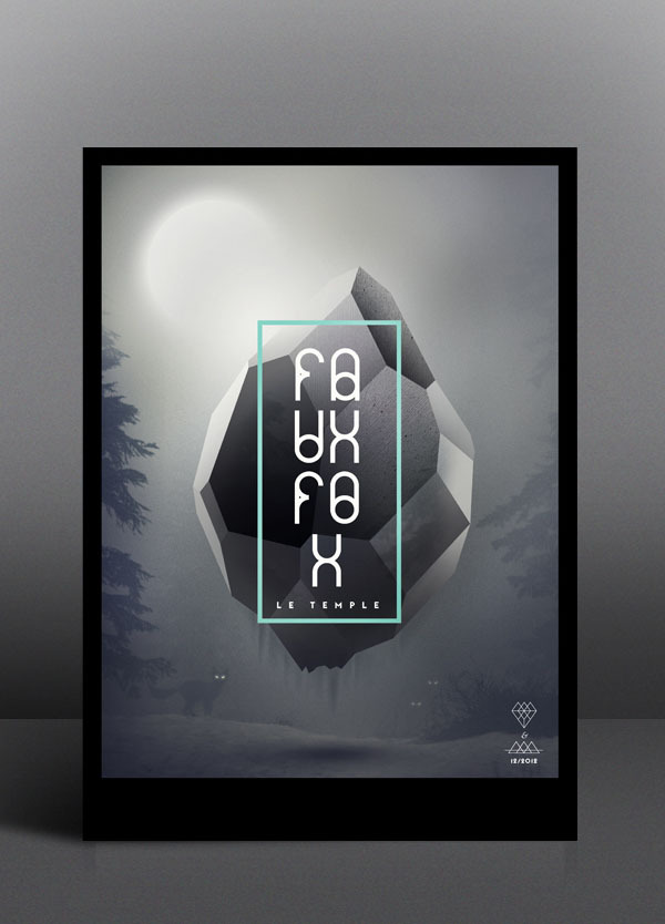
The last two images are brilliant examples of a working relation between type and image. The second design exhibits this much more clearly, experimenting with arrangement by setting samples of the typography behind the main image. It gives the design more dimensions, and has more depth than a standard two layer, type on image piece. More importantly, the images are clear & the type is legible.
+++
No comments:
Post a Comment