Showing posts with label Yearbook Concept. Show all posts
Wednesday, 9 January 2013
Tuesday, 8 January 2013
The Wrap-Around & First Mock Up
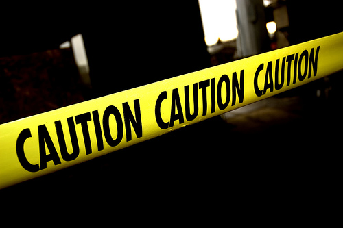
We thought of a wrap around as a way to enhance the concept of 'warning', and to give us a chance to utilise the hazard tape. We thought it would be a good idea to have it perforated at both edges of the tape, which allows the user to rip apart and pull away to reveal the final publication. Below is my first idea, which was tweaked by Jamie to a horizontal design:
(nets for the front cover and wrap around)
Developing The Front Cover
The next important decision was the exclamation mark. Experimenting with different shapes and sizes, Jamie & I agreed the far right example was the most appropriate for the concept.
As we started experimenting with the warning symbol, we realised there could be another symbol that would be better suited for the 'Extremely Hot' statement - the Hot Surface warning. I quickly mocked up a version of this and put it in place of the exclamation mark. I think it works better as it is a lot more relevant than the previous symbol.
Below are variations of the cover using the new symbol, also looking at different phrases to convey a better message:
After much debate, we came up with the 'Hot Talent' slogan. It's relevant to the group, the symbol and the concept we are trying to communicate. Instead of using an existing symbol, I proposed a slight twist that will still make it recognisable, yet more appropriate for the concept. I created a vectored pencil to make it closer to Graphic Design, an object that resembles the original straight line to convey a surface.
Variations of the new symbol below:
Development of the vectored pencil, adding more detail each time:
Digitising The Idea
I started with a 210x210 document, with 20 pages for experimentation. The first job was to create an acceptable triangular warning sign, which I did by creating an equilateral triangle and rounding off the edges - tweaking it until I got a shape that I was happy with working with.
Monday, 7 January 2013
Looking At Existing Material
Material that Jamie and I are looking at - simple, vectored imagery to communicate a message quickly and efficiently. The colour scheme is important, and we're aiming to respond to the black on yellow combination to communicate the idea of 'warning'.
Yearbook Concept Brief: Initial Discussion
Before the Christmas break, myself and Jamie Flear arranged to collaborate on the concept brief for the yearbook. We put an advertisement on the course board, hoping that two more people were looking to collaborate for the pitch. Three weeks later, and we've had no offers. It looks to be a two man job.
Our initial discussion went fairly well, we managed to discuss a few concepts and decide on a final idea that we would take forward - based on the talent on show on the course.
We aim to communicate an idea of caution, to prepare readers of what is ahead. Not in a negative way, more of a 'prepare to be blown away' kind of way. Initial ideas consist of the existing caution signage, and the colour schemes used to portray the message. More development is yet to come, but as of now, I'm glad to have the concept pinned down in such a short space of time - and with two days to go until the deadline.
Subscribe to:
Posts (Atom)