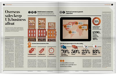
This is an incredible source for data visualisation inspiration. There is a wide range of graphic styles, from bar graphs, flow charts and pie charts - all to communicate data in a graphic form. It also demonstrates an intricate link between the graphics and the text - and how they can complement each other to tell a whole story.
It is important to be consistent with colour choice; having a simple colour palette stops the infographics from being too complex and overwhelming.
+++


No comments:
Post a Comment