Showing posts with label Brief 5 - Context. Show all posts

Wednesday, 13 March 2013

More Typographic Posters


Part of the branding for the Republique Theatre based in Copenhagen, Denmark. This typographic poster utilises the bronze circle to give the design recognition and to represent the brand. The overall composition utilises bold letterforms that could be read from a distance, packaged in a solid black frame and photographed professionally on a background that allows it to stand out.
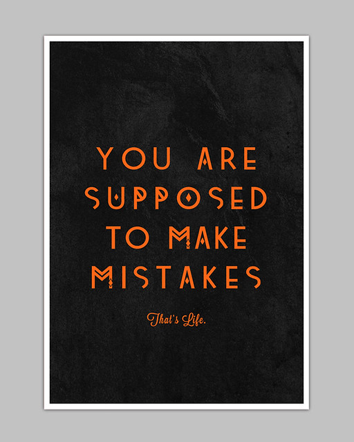


My initial thought when viewing this poster was the unorthodox letterforms are similar to my alternative typeface that I used in the screenprints last week. It adds interest to the piece, and distances itself from the usual, predictable typefaces commonly used in compositions like these.
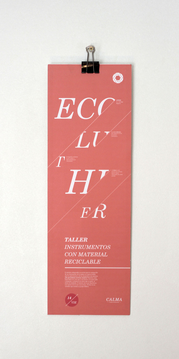


Devices that mask the letterforms are interesting but aren't very functional if the designer wants to communicate a message. The format is interesting, however, stepping away from the traditional A# formats that are mainly adhered to with other typographic posters. 


Another example of where the photography complements the design and creates a mood outside of the design itself. The collection of books and the vase of flowers on the bookshelf give it a homely feel that backs up the statement of the poster. It goes to show that the photography can add another element of interest outside the intended design. Here are more examples of this:


+++


As a typographic poster, I have never seen anything like this. Using numbers to correspond to the order of the words, the viewer is forced to piece together the message themselves. Is this too much work for something that should hold a clear message? Maybe. There is definitely an element of interest, but the line between interest and functionality has definitely been crossed in this example. I like how it pushes the boundaries of typographic design and strives to create an interesting image, however, and the composition of the design suits the message.

Friday, 15 February 2013

Using Wood As A Stock For Design

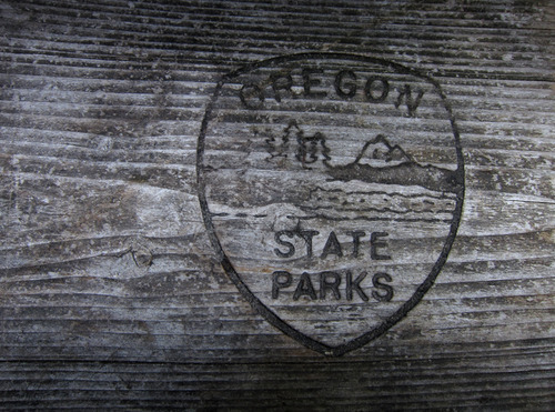
Throughout my time on the course, my design has been focused primarily on print and the processes used to get a final outcome. Never have I considered wood as a material to host my final outcomes - it has been exclusively paper and card up until this point. I think it adds a hand-rendered quality to the designs as wood is a material rarely used in graphic design, even more so in mass produced print-runs.

Burning or etching a design onto wood is a technique that requires the constant attention of the designer, much like the process of screen printing. It shows the designer is prepared to make extra effort in the process of the final outcome, and therefore adds an element of desirability to the final piece.


These two examples show the type of designs that can be effectively transferred to wood. The designs have to be simple in a sense, photography would not be suitable for this process. Typographic and logo/icon designs are perfect for wooden outcomes, and it is something to consider as extensions to my Movie Scene Icons and They Said What briefs.

Giving Photographs Personality

When speaking to Chris Jackson of Elmwood and Aidan Nolan of A.N.D, they pointed out that my photography in my typographic posters was a weakness in my portfolio. Therefore, I want to improve my photography to give my FMP justice. These are examples of photography that frame the work nicely and help to give it a professional feel. This can be acted on especially in my typographic poster brief.


Wednesday, 30 January 2013

Overprinting


Overprinting can create an interesting aesthetic value through screen printing designs. It can be replicated through digital print, but the unique outcome of the hand-rendered process gives a desirable quality when it comes to selling and exhibiting typographic design.

This particular example is nothing spectacular in terms of design composition, but it demonstrates the interesting relationship between the red and the cyan when overprinted. Interestingly, these colours are used to create stereoscopic images, where overprinting is a necessary process for the 3D effect to work.

+++


Although they're not screen printed, these digital images demonstrate an overprinted outcome, using it to take less emphasis off the red foreground - allowing the background image to stand out more.

+++