I thought I would start by testing out the unorthodox characters such as the ones mentioned in one of my previous posts. Visual proof really that these characters are key-able, and the effort taken to make this possible. Everything looks fine, but I hope my german 'S sharp' letterform doesn't get confused with my B. I think it looks okay though.
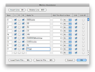
The numerals looked a bit squashed, so I thought I would give them room to breathe. I noticed Helvetica had matching widths on all numerals except 1, so I copied them over using the Metrics Assistance feature. Pretty self-explanatory, just copying the values over to the other 8 numerals.
I noticed some glyphs had weird values, so I remedied them using both numerals and letterforms to make sure they stayed consistent.
The @ symbol needed slight adjustment, as well as the pound sign.
I noticed the brackets were very inconsistent. I had to back into illustrator to fix this, but they now look like a set.
The kerning between the two 0's was a little off, so I adjusted it slightly.
I found the trademark symbol to be a little too big, so I reduced the size and the spacing between the T and the D.
I did a few tests to make sure the metrics were okay by using words from a Loud & Quiet magazine laying around. Here are some of the results.


No comments:
Post a Comment