
Tim Ruxton has created a beautiful promotional piece for his typeface - which is similar to mine in its exclusively uppercase letterforms. He has used only his typeface, and kept things simple as his typeface is not really suitable for body copy. Here it is:
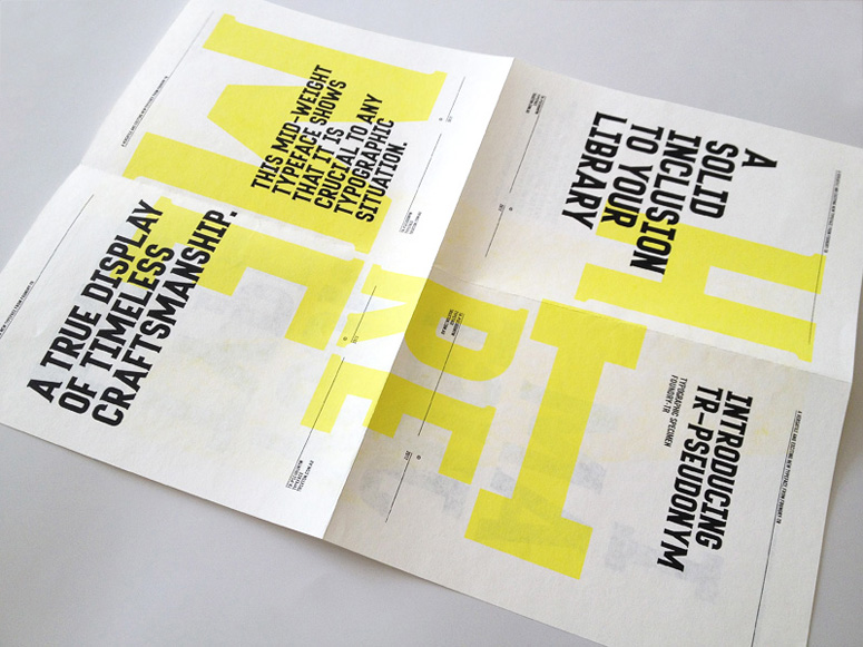
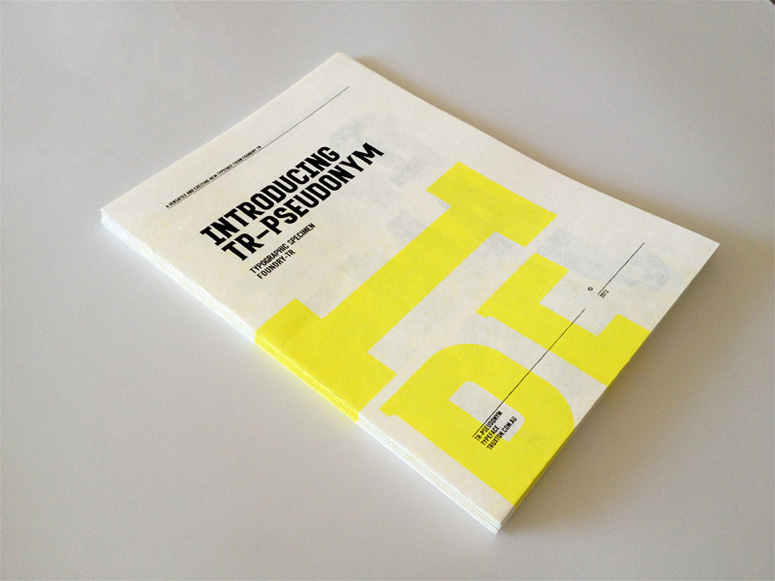
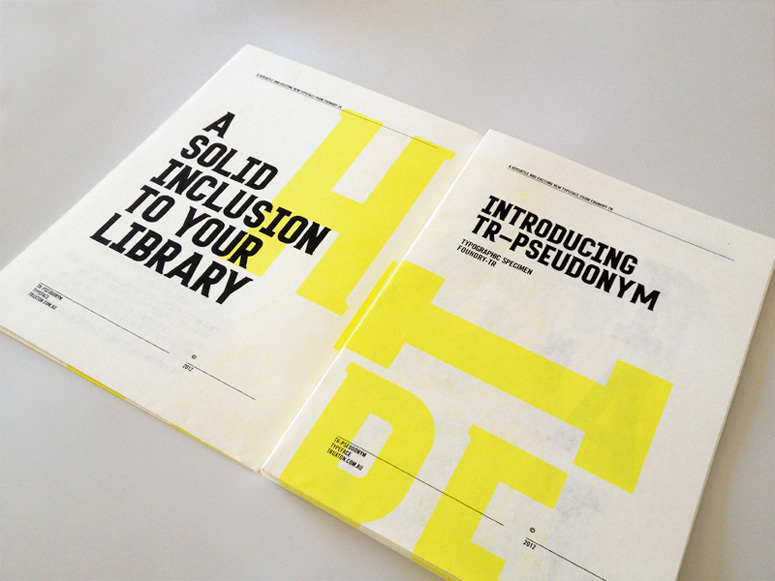
I really like the subtlety of the yellow; it allows the black text to stand out while still demonstrating the letterforms on a larger scale. I think two-colour plus stock would be the better choice as it keeps things simple and can help to secure an identity of the typeface, which will help in the promotional side of the font.
The fold-out format could be an option if I wanted people to take it away, it keeps it compact and avoids the use of poster tubes.
No comments:
Post a Comment