
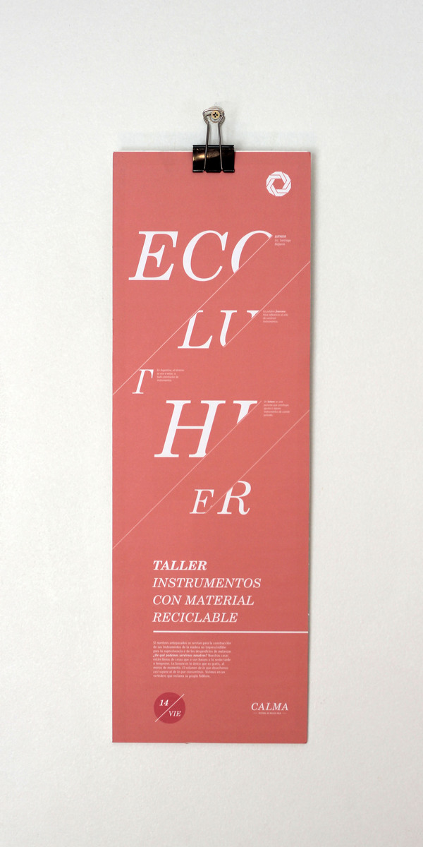
As I was searching for this image I found some very interesting typographic posters that reflect my practice really well. I don't know how I missed them the first time, but why not feature them now?

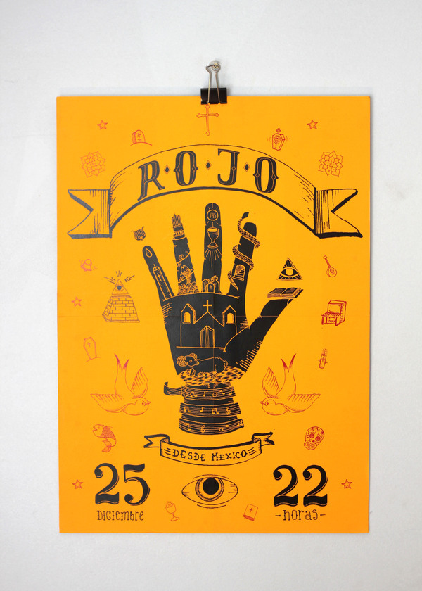
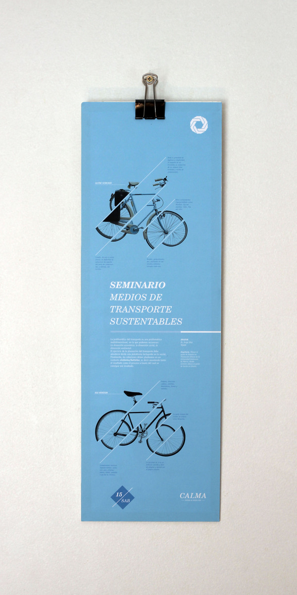
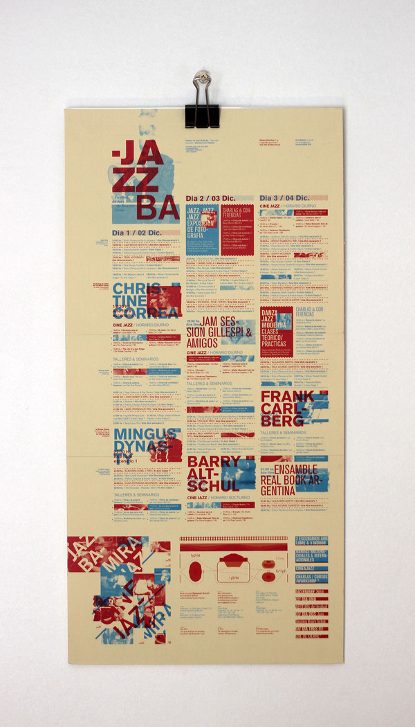
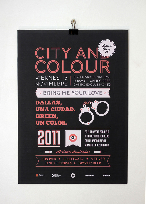
They're really well considered and all utilise a simple colour scheme. I like the inclusion of icons as it sticks to the style of communicating information in its most simple form: text & icons. There are also some nice overprinting effects that give the poster depth and a sign that it was screenprinted. Which also adds a personal touch to the design.
No comments:
Post a Comment