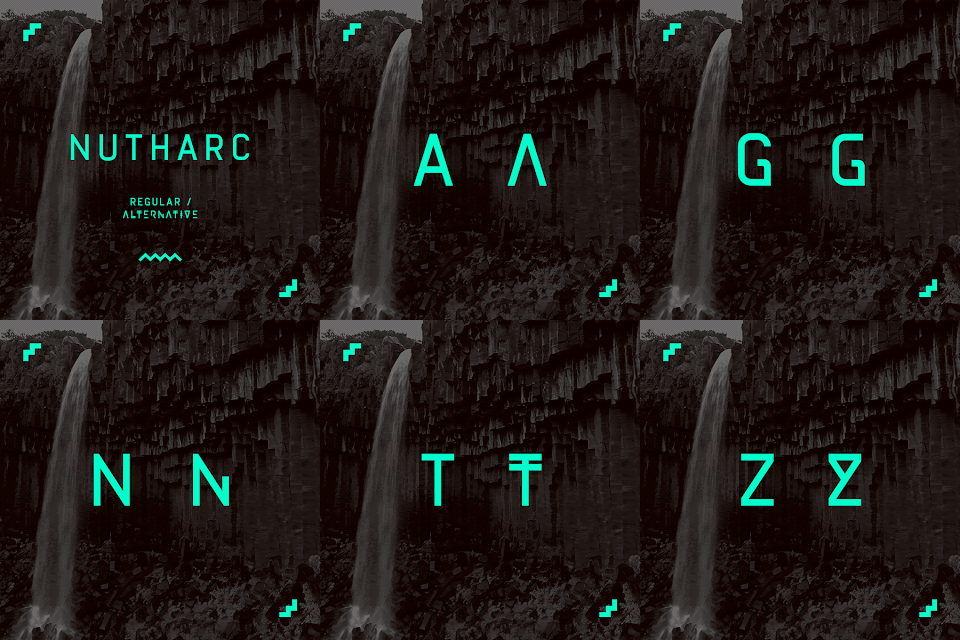
Here's development using background imagery based off the Ten Dollar Fonts examples. I found that darkening the background image brings out the colours a lot better, and I achieved this by simply putting an opaque sheet of black over the top of the images.
I opted to go for aqua green as it was vibrant and stood out better on the darkened images.
(Process of new image)
Cropping the image
Black & White effect, with levels enhanced to give contrast
Added a opaque layer of black to allow the colours to stand out more
Choice of colour
+++
Here are the GIFs that I produced using Photoshop's timeline feature:
Introducing some tweens in between the introduction page and the alphabet sequence. It breaks up the sequence nicely and the final one brings things to a close. I also reduced the size of the letters slightly to give them more breathing space, and to even the composition out.


No comments:
Post a Comment