
It turns out there was more to do than I originally thought. This is the development of a select number of glyphs and the techniques I used to make them into key-able aspects.
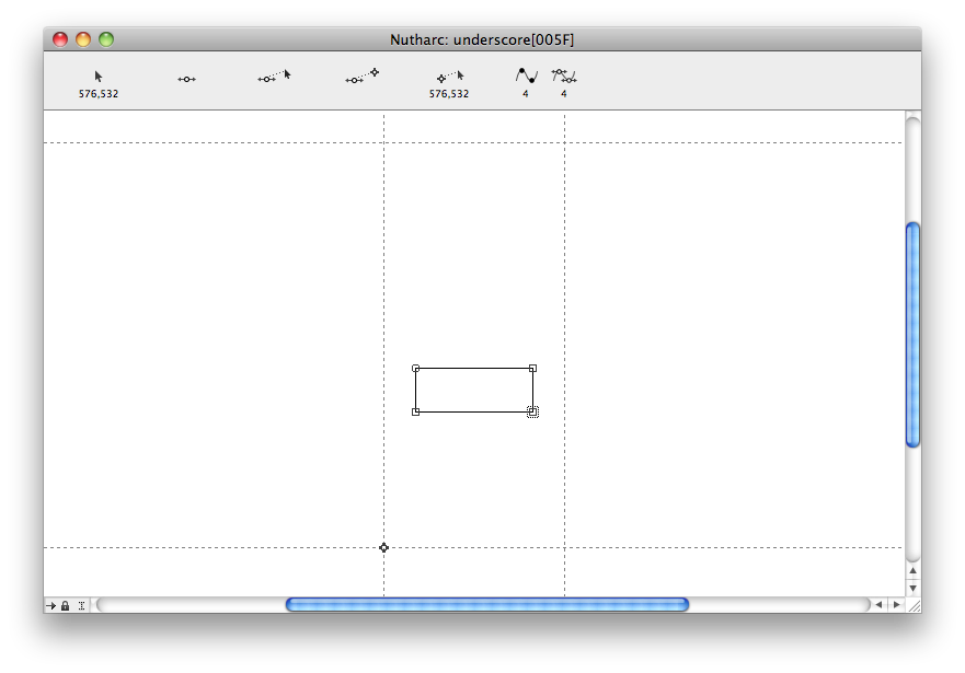
The underscore, much like the extended hyphen and the minus sign, is copied straight from the existing hyphen and manipulated and moved directly in the Fontographer program.


The asterix symbol was simply one line rotated and copied three times to make an equally spaced, 6-pronged, shape. I compared the size to Helvetica's and decided it was probably too big, so I made alterations in the edit menu.
This was the case for a lot of my characters - I would compare the size and spacing to typefaces such as Helvetica or Univers, and use that as a guide in the making of my font.


I adjusted the spacing and weight of the tilde to make it thinner, as I thought it stood out too much over the letterforms. The first test was a little too thin, so I increased the weight again to reach a happy medium.


No comments:
Post a Comment